How to Use Symmetry in Background Design to Create Visual Calm in Meetings
Start with a central axis to align all background elements, using grid guides for precision. Mirror text and icons evenly to create visual harmony, reducing cognitive load and keeping your audience focused. Use only three core colors and repeat simple shapes like rectangles to reinforce calm, ordered layouts. Guarantee exact alignment across all devices, including projectors. Avoid perfect symmetry every time-slight variations prevent rigidity and keep attention. Test at 10 feet to confirm clarity.
Notable Insights
- Align all background elements along a central axis to create balanced, professional layouts that enhance visual calm.
- Use mirrored designs across the central axis to achieve symmetry, reducing visual noise and guiding audience focus smoothly.
- Precisely align text and graphics using grid guides to prevent distractions and maintain a clean, orderly appearance.
- Limit color use to three harmonious hues with soft neutr游戏副本
Start With a Central Axis for Balanced Slide Design
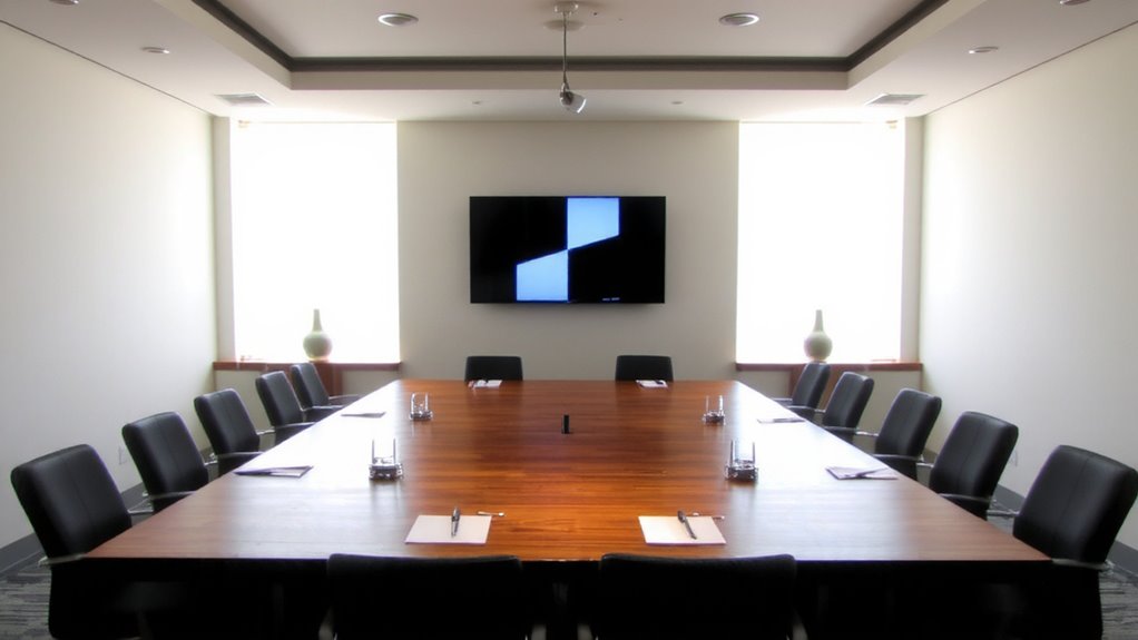
While symmetry might seem subtle, starting your slide design with a central axis gives your background a polished, professional look that draws viewers in without distracting from the content. You’ll create natural order by aligning elements along this spine, making information easier to follow. Use grid alignment to position text boxes, images, and icons with precision-this consistency strengthens readability and visual flow. For more dynamic layouts, consider radial balance, which arranges components around a central point, adding movement while maintaining harmony. Both methods reduce cognitive load, helping your audience focus on your message. But don’t overdo it-too much symmetry can feel static or artificial. Test your design at actual viewing distances; what looks balanced on screen may not project cleanly. Always prioritize clarity over cleverness. A well-structured layout supports your talk, not the other way around.
Mirror Elements for Instant Visual Harmony

If you want your slides to feel instantly balanced and visually cohesive, mirroring elements across a central axis is a simple but powerful technique that delivers results. This mirrored repetition creates reflective balance, guiding the viewer’s eye smoothly and reducing visual noise. You don’t need complex tools-most presentation software includes alignment guides and duplicate functions to help you achieve symmetry quickly. Below is how symmetry impacts audience perception:
| Emotion | Asymmetrical Design | Symmetrical Design |
|---|---|---|
| Calm | Low | High |
| Focus | Moderate | High |
| Trust | Variable | Strong |
| Engagement | Sporadic | Consistent |
| Clarity | Medium | High |
While mirrored repetition enhances professionalism, overuse can feel rigid. Combine it with subtle contrast in color or texture to maintain warmth. Reflective balance works best when it supports content-not overwhelms it. Test slides in a real meeting environment to confirm readability and emotional impact.
Align Text and Graphics With Precision

You’ve already seen how mirroring elements creates visual harmony, and that same balance extends to how text and graphics relate to each other on the slide. Proper text alignment and graphic precision aren’t just about neatness-they’re critical for creating visual calm. When text lines up exactly with graphic edges or center points, the eye moves smoothly, reducing cognitive load during meetings. Use grid lines or snap-to guides in PowerPoint or Google Slides to achieve exact positioning. Left-align body text consistently, and center headings only if the layout is symmetrical. Misaligned elements-even by a few pixels-undermine professionalism. You’ll need to zoom in to check placement, and templates can help maintain consistency across slides. But don’t over-automate: some themes distort spacing. Test on multiple screens, since alignment errors often show up on projectors or shared Zoom feeds. Precision matters, but only when it serves clarity.
Use Minimal Colors and Shapes for Cleaner Symmetry
A single color scheme with no more than three core hues often makes symmetry feel intentional rather than fussy. You’ll find that using minimal colors allows your audience to focus on content, not distractions. Try color blocking with soft neutrals and one accent shade-it creates visual balance without overwhelming. Pair this with shape repetition, like evenly spaced circles or aligned rectangles, to reinforce order and rhythm. You don’t need complex graphics; simple, mirrored forms work best. Just keep in mind that too much repetition can feel rigid, even boring, so vary size or spacing slightly for subtle dynamic balance. Overdoing symmetry may also make slides feel static, so test your designs in actual meeting lighting. Real-world viewing matters-what looks clean on your screen might lack contrast on a projector. Stick with matte finishes to reduce glare.
Leverage Symmetry to Reduce Slide Clutter
Symmetry isn’t just about visual appeal-it’s a practical tool for cutting down clutter on your slides. You can use grid layouts to organize content evenly, making it easier for your audience to follow without feeling overwhelmed. When elements align symmetrically, they create focal balance, drawing attention naturally to key points without extra graphics or animations. This approach reduces visual noise, so your message stays clear. But don’t force symmetry where it doesn’t fit-misplaced alignment can distort emphasis or hide important data. Grids should support content, not dictate it. Test your slides at a 4:3 aspect ratio and from a 10-foot distance to guarantee readability. Built-in template guides in tools like PowerPoint or Google Slides help maintain alignment, but adjust manually when needed. Strong structure improves clarity, but only when it serves purpose over perfection. Let balance guide, not govern.
Avoid Over-Symmetry to Keep Slides Engaging
Isn’t balance supposed to make designs feel steady, not stale? It can-when you avoid over-symmetry. Perfect alignment on every slide kills energy and makes content predictable. Instead, introduce creative imbalance to draw attention where it matters. Shift a headline slightly off-center or place an image asymmetrically against a symmetrical grid. These small breaks create dynamic contrast without chaos. You’re not sacrificing calm-you’re guiding focus. Think of it like a well-organized desk: everything has a place, but not every item lines up perfectly. Over-symmetry risks visual fatigue, especially in longer presentations. But too much imbalance overwhelms. The key is intentionality-each deviation should serve clarity, not just style. Test your slides from 10 feet away; if your eye doesn’t know where to land, recalibrate. Use grids as a foundation, not a rulebook.
On a final note
Symmetry gives your slides a clean, calming structure-perfect for keeping meetings focused. Center-align key elements, mirror graphics, and pair minimal shapes with consistent spacing to reduce visual noise. But don’t overdo it; strict symmetry can feel rigid. Use it strategically, not constantly. Test layouts on a 13–16″ screen to guarantee clarity at common viewing distances. High-contrast tones and alignment guides in PowerPoint or Keynote help maintain precision without slowing your workflow.