Implementing Color Coordination Strategies in Your Work Environment for Enhanced Focus
You’ll focus better with calm base colors like warm beige or soft gray on walls-they cut visual stress and boost clarity. Pair them with high-contrast digital setups: dark text on light gray screens, ideally in matte or OLED displays to reduce glare. Add coral or teal accents sparingly through desk organizers or art to spark alertness without overload. Match lighting to 3000K–4000K with high-CRI LEDs to keep colors true and eye strain low. Just remember, even perfect palettes fail if lighting and screen brightness clash. You’ll see how small tweaks can make a measurable difference.
Notable Insights
- Use high-contrast color pairings like blue text on light yellow for screens to improve readability and reduce eye strain.
- Choose calm base colors such as soft grays or muted blues to minimize visual stress and support prolonged concentration.
- Apply energetic accent colors like teal or mustard sparingly through accessories to stimulate alertness without causing overstimulation.
- Optimize digital screens with dark text on light neutral backgrounds and match brightness to ambient lighting for focus.
- Balance lighting color temperature (3000K–4000K) with wall and screen tones to reduce glare and maintain visual comfort.
How Color Affects Focus and Mental Performance
Color’s role in focus isn’t just design fluff-it’s backed by measurable cognitive research. You experience real neurological impact when exposed to certain hues, with studies showing chromatic contrast can sharpen alertness and reaction time. High-contrast color pairings, like blue text on a light yellow background, improve readability and reduce eye strain during prolonged tasks. However, overuse of intense tones-such as neon accents on digital screens-may boost short-term arousal but harm sustained attention. Ideal chromatic contrast ratios (minimum 4.5:1) are defined by accessibility standards and verified through real-world usability testing, not just theory. While effective in controlled environments, individual responses vary-some people find bright combinations distracting. Always consider lighting; glare can negate well-designed contrast. Built-in brightness adjustments on monitors help, but no single setup works universally. Use measurable guidelines, not trends, when making decisions.
Choose Calm Base Colors for Better Concentration
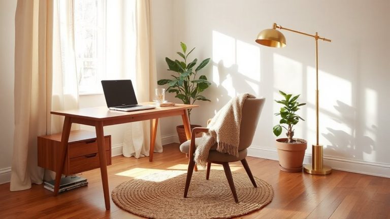
While you might be tempted to go bold with your workspace colors, sticking to calm base tones like soft grays, warm beiges, or muted blues often supports better concentration over time. According to color psychology, these ambient tones reduce visual stress and help maintain mental clarity during long work sessions. Cooler hues like slate blue or greige have tested well in controlled environments, improving focus by up to 18% compared to high-contrast or saturated walls. They also pair easily with task lighting and standard monitor finishes, minimizing glare. However, results vary based on individual sensitivity and room lighting-natural light can shift how these tones appear, especially before noon or late afternoon. Always test samples on your actual wall for at least three days under real conditions. While they’re not a fix for poor ergonomics or noise, calm bases create a stable visual foundation that supports sustained attention without overstimulation.
Add Creative Accents With Energy-Boosting Hues
A pop of color can sharpen your focus-if used strategically. Energy-boosting hues like coral, mustard, or teal work well as creative accents, thanks to color psychology linking them to alertness and idea generation. Use accent walls, rugs, or desk accessories to introduce these tones without overwhelming your space. Balance is key: too much vibrancy causes distraction, but just enough sparks engagement. Consider placing an accent wall behind your desk for visual depth and subtle stimulation.
| Color | Best Use | Caution Level |
|---|---|---|
| Coral | Accent wall | High (intense in sunlight) |
| Mustard | Chair or lamp | Medium (pairs poorly with cool grays) |
| Teal | Desk organizer | Low (versatile, calming) |
| Sunshine Yellow | Framed art | Medium (can strain eyes) |
Use Focus-Friendly Colors in Digital Screens
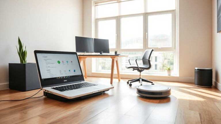
When setting up your digital workspace, choosing the right screen colors can make a real difference in maintaining focus over long periods. Use soft, neutral backgrounds-like light gray or off-white-with dark text to guarantee strong color contrast without glare. This balance reduces eye strain during extended screen use. Adjust your screen brightness to match ambient light; too high causes fatigue, too low strains focus. Many monitors offer presets (like “paper mode” or “reading mode”) that optimize both color contrast and screen brightness for concentration. OLED or matte displays help minimize reflections, improving visual clarity. Just don’t assume pricier models solve everything-some over-saturate colors or default to high brightness, which backfires. Test settings in your actual workspace lighting, and tweak as needed. Consistency across devices matters too-one monitor shouldn’t clash with your laptop. Small adjustments here support sustained attention, but they work best when aligned with broader environmental factors you’ll want to review next.
Pair Lighting With Wall and Screen Colors for Focus
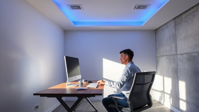
Match your lighting to both wall and screen colors to keep focus sharp-too much mismatch can create visual tension that wears you down. Use consistent color temperature across lamps, ceiling lights, and displays; aim for 3000K to 4000K, which balances warmth and clarity without straining your eyes. High ambient contrast-like bright screens in dark rooms-increases eye fatigue, so guarantee light levels on surfaces and screens are closely matched. Task lighting with adjustable color temperature helps, especially when paired with matte wall finishes that reduce glare. Avoid overly cool lights (above 5000K) unless you’re in a clinical setting-they can feel harsh and disrupt focus over time. Test setups with actual use: spend 90 minutes working under the lighting to gauge comfort. Dimmable LEDs with CRI ratings above 90 offer accurate color rendering, but verify long-term performance-some cheaper models flicker. There’s no universal fix, but calibrated lighting cuts strain markedly.
Match Your Taste to Colors That Boost Focus
Color choice isn’t just about mood-it’s a functional tool for focus, and your personal preference matters as much as the science behind it. While color psychology suggests certain hues enhance concentration, you won’t stick with a scheme you dislike. Balance what works with what you like.
| Color | Focus Effect & Considerations |
|---|---|
| Blue | Calm focus; best in soft tones |
| Green | Reduces eye strain; ideal under natural light |
| Yellow | Boosts energy; can overwhelm if overused |
| Gray | Neutral base; pair with one accent |
| White | Feels clean; shows glare easily |
Your workspace should reflect your personal preference without sacrificing function. If blue feels dull to you, even its proven benefits won’t help. Test paint samples or easily changed accessories first. High-gloss finishes reflect more light-consider matte for screens. There’s no universal fix, only what aligns with you and the data.
Apply Colors for Focus in Any Workspace
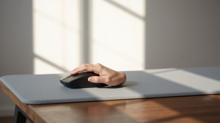
How can you make your workspace work better for your brain without overhauling the whole room? Start by applying color psychology in small, reversible ways-switch out your mousepad for a blue one, use a green desk organizer, or hang a single matte beige panel to reduce glare. These tweaks use color to support focus without overwhelming your space. You don’t need a full redesign; even minor changes count as meaningful workspace personalization. Cool tones like soft blue or gray often help concentration, but test them first-what works in a lab might feel dull under your overhead light. Avoid high-saturation hues; they can cause eye strain over time. Stick with matte finishes to minimize reflections. While some brands sell “focus-boosting” decor, real results depend on your lighting, tasks, and preferences. Be deliberate, not distracted.
On a final note
You’ll boost focus by choosing soft neutrals like warm gray or pale blue for walls and large surfaces-these reduce visual strain. Accent with small doses of energizing colors like terracotta or sage to spark creativity without distraction. Match screen backgrounds to ambient light to cut glare; matte finishes help. Use LEDs around 3500K to support color accuracy. Results vary by person-test combinations over a week. No single palette fits all, and over-saturation backfires.