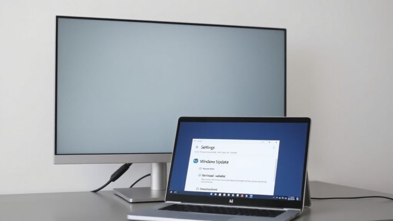
Maximizing Readability With High Dynamic Range (HDR) in Home Office Environments
HDR can greatly enhance readability in your home office if you choose a monitor with true HDR performance-look for VESA DisplayHDR 600 or higher and at least 600 nits peak brightness. Higher contrast makes text sharper, while proper calibration guarantees whites stay crisp and grays remain neutral, reducing eye strain. However, budget models often underdeliver, with poor tone mapping and dim panels. Pair HDR with low blue light settings and a Delta E <2 for accuracy. The right setup transforms document work-but only when matched with certified hardware and proper tuning. There’s more to get right for long-term comfort.
Notable Insights
- HDR enhances text contrast with deeper blacks and brighter whites, improving character clarity and reducing eye strain during prolonged reading.
- Choose VESA DisplayHDR 600 or higher certified monitors to ensure sufficient brightness and consistent tone for reliable readability.
- Calibrate HDR settings to 300–500 nits peak brightness to match ambient lighting and prevent glare while maintaining text legibility.
- Use IPS panels with Delta E <2 for accurate colors and stable image quality, crucial for reading documents with charts and graphics.
- Ensure software and apps support HDR to avoid oversaturation, improper scaling, or washed-out text that can impair reading comfort.
Is HDR Worth It for Your Home Office?
So, is HDR really worth it for your home office? It depends. If you do color grading or edit visuals regularly, HDR’s expanded contrast and wider color gamut make a noticeable difference, offering more accurate previews and reducing guesswork. For gaming performance during breaks, HDR adds depth and realism, though input lag varies by display-check specs carefully. But not all HDR is equal: look for VESA DisplayHDR 600 or higher for meaningful benefits, not just the badge. Many budget monitors claim HDR but deliver poor brightness or inconsistent tones, hurting readability. You’ll also need HDR10 or Dolby Vision support in your system. Monitors like the LG UltraFine series back claims with calibration tools and solid warranties. Still, if your work is text-based, the upgrade might not justify the cost. Test real-world usage before buying.
How HDR Reduces Eye Strain and Boosts Focus
While HDR won’t eliminate eye strain on its own, it can meaningfully reduce fatigue and sharpen focus when paired with the right display specs and lighting conditions. You’ll benefit most from an HDR display that also manages blue light effectively-many quality monitors include low blue light modes certified by TÜV Rhinelands. A higher refresh rate, like 60Hz or more, helps maintain visual smoothness during scrolling, which cuts down on subtle eye stress over time. HDR’s wider contrast lets your pupils adjust more naturally, similar to real-world lighting, reducing strain in dim or mixed lighting. But don’t assume all HDR is equal-look for HDR400 or better, though true benefits start at HDR600. Also, motion clarity from refresh rate matters more for focus than peak brightness. Pair HDR with proper screen positioning and ambient lighting, or you’ll negate the gains.
Why HDR Makes Text and Documents Easier to Read
Clarity starts with contrast-HDR makes text pop by delivering deeper blacks and brighter whites, so characters stand out sharply against the background. With better text contrast and color precision, documents appear crisper and colors in charts or images stay true, reducing misreading. You’ll notice fewer eye adjustments, which keeps focus steady during long sessions.
| Feature | Standard Display | HDR Display |
|---|---|---|
| Text Contrast | Moderate, often flat | High, sharp edges |
| Color Precision | Slightly off hues | Accurate, lifelike |
| Brightness (nits) | 250–300 | 600+ (peak) |
| Black Level | Grayish | Deep, true black |
| Reading Fatigue | Noticeable over time | Reduced markedly |
While HDR improves readability, it only works if content and software support it. Not all apps optimize for HDR, and oversaturation can backfire. Use calibrated modes to maintain text legibility and avoid excessive brightness indoors.
Picking the Best HDR Monitor for Productivity
Your productivity hinges on more than just screen size-choosing the right HDR monitor means balancing brightness, color accuracy, and panel performance to match real-world tasks. You’ll want at least 1000 nits peak brightness for true HDR10 support and reliable contrast precision, especially if you’re switching between documents, spreadsheets, and video calls. IPS panels typically deliver better color accuracy, with Delta E <2 ideal for design-adjacent tasks, while VA panels offer deeper blacks but can show color shift at angles. Look for monitors certified under HDR600 or HDR1000 for guaranteed performance. USB-C connectivity with power delivery simplifies cable management. Keep in mind that higher refresh rates (120Hz+) don’t boost productivity much and may increase eye strain during long sessions. Always check return policies-real-world comfort varies, even with solid specs.
How to Calibrate HDR for Comfort and Clarity
Why does your HDR content sometimes look washed out or too harsh for long work sessions? Because without proper calibration, even high-end monitors can struggle with color accuracy and brightness uniformity. You need to adjust your display using built-in HDR presets or professional tools like a colorimeter. Start by setting the peak brightness to match your ambient light-usually between 300 and 500 nits for most home offices. Check that whites look crisp but not glaring, and grays stay neutral. Poor brightness uniformity can create hotspots, making prolonged reading uncomfortable. While factory calibration helps, real-world testing shows deviations over time. Recalibrate every few months. Keep in mind: aggressive HDR settings may boost contrast but hurt readability. Balance enhances clarity. The goal isn’t maximum intensity-it’s sustainable, accurate visuals that support focus without eye strain.
On a final note
HDR’s worth it for your home office if you prioritize visual comfort and clarity. It reduces eye strain by balancing stark contrasts and improves text readability through better brightness and color depth. Look for monitors with at least HDR400 certification, 300+ nits peak brightness, and factory-calibrated color accuracy. But know the trade-offs: higher cost, occasional glare in bright rooms, and inconsistent content support. Calibrate regularly to maintain performance.