Screen Brightness and Contrast Settings: Tips for Reducing Visual Fatigue While Working Remotely
Match your screen brightness to the room-100–150 cd/m² in dim light, 200–300 cd/m² in bright rooms-since automatic sensors often overcompensate and cause glare. Boost contrast to 70–80% for sharper text, but avoid oversaturation. Use Night Mode in the evening to reduce blue light, though disable it when color accuracy matters. Position your monitor away from direct light, and consider dark mode with moderate text scaling for comfort. There’s more to optimizing your setup than brightness alone.
Notable Insights
- Match screen brightness to ambient light, using 100–150 cd/m² in dim rooms and 200–300 cd/m² in bright spaces.
- Set contrast to 70–80% initially, adjusting manually for clear text and sharp edges without oversaturation.
- Enable Night Mode in the evening to reduce blue light and support natural sleep cycles.
- Position monitor to avoid glare from windows or lights, ideally slightly below eye level and 20–30 inches away.
- Use dark mode with moderate text scaling (120–150%) in low-light settings to reduce eye strain.
Match Your Screen Brightness to the Room
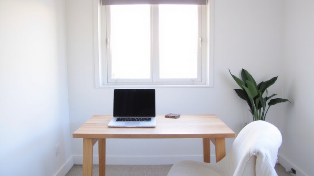
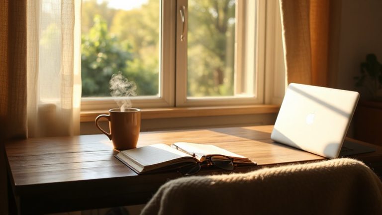
Most of the time, setting your screen brightness to match the ambient light in your room makes a noticeable difference in eye comfort and image quality. You’ll reduce glare and minimize strain, especially during long work sessions. When your screen is much brighter than the surrounding room lighting, it forces your eyes to constantly adjust, leading to fatigue. Matching brightness to ambient levels helps maintain visual balance. For dim rooms, lower brightness-around 100–150 cd/m²-usually works best; in well-lit spaces, you might need 200–300 cd/m². Many modern monitors have ambient light sensors, but they’re not always accurate. Manual adjustment gives you more control. Keep in mind that overly dim screens in bright environments can be just as tiring. You’re aiming for harmony between screen output and room lighting. This isn’t a set-it-and-forget-it fix-ambient levels change throughout the day, so you should tweak as needed.
Boost Contrast for Sharper, Easier-to-Read Text
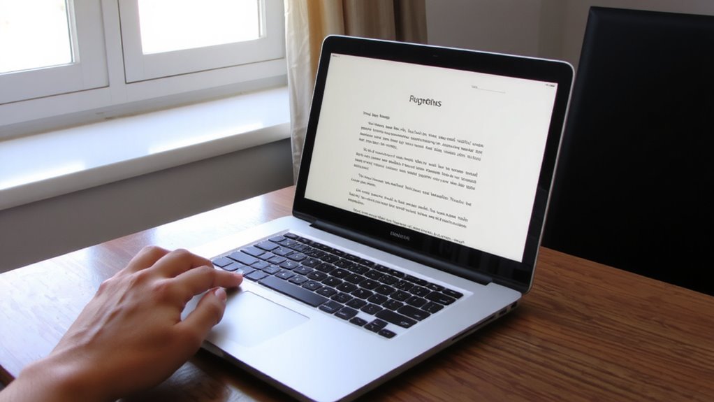
You’ve already tweaked your screen brightness to suit the room-now go further by adjusting contrast to make text pop without straining your eyes. Increasing contrast sharpens edges between text and background, boosting readability during long work sessions. Aim for high contrast-like black text on a white background-but avoid oversaturation that can cause glare or halo effects around letters. Most monitors let you adjust contrast via on-screen settings; start at 70–80% and fine-tune based on content. High contrast helps on both matte and glossy panels, though matte reduces reflections in bright rooms. Too much contrast, though, may deepen eye fatigue over time, especially in dim lighting. Test different levels with documents and spreadsheets to find your sweet spot. Don’t rely on default presets-they’re often too harsh. Manual adjustment gives you precise control, balancing clarity with comfort for daily remote work.
Turn On Night Mode to Reduce Evening Eye Strain
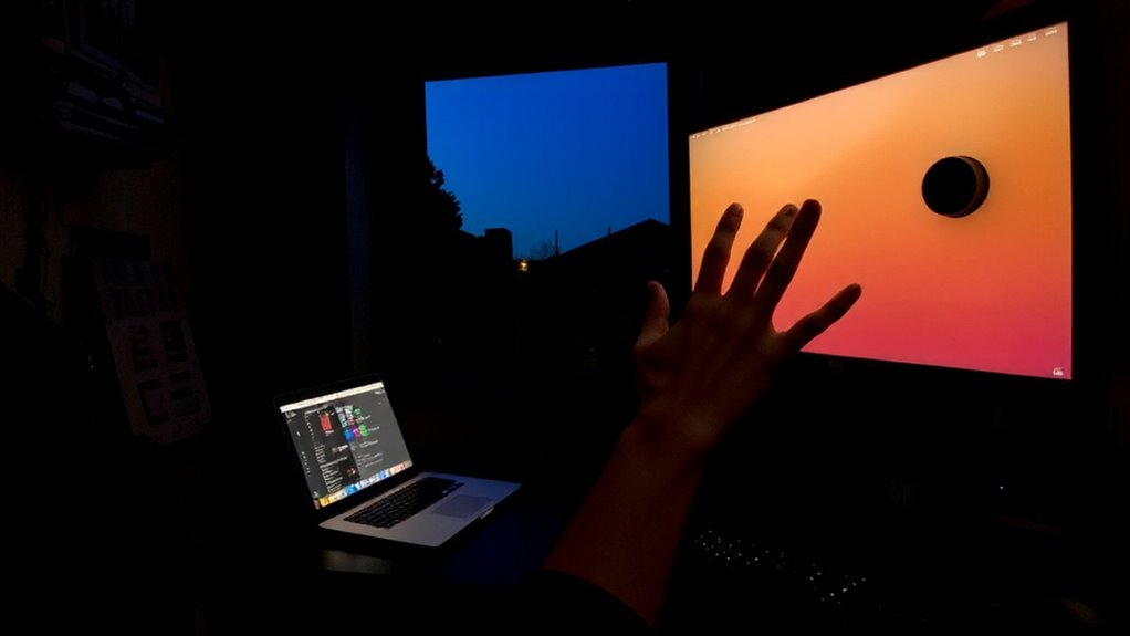
Ever wonder how to ease eye strain during late-night work sessions? Turning on Night Mode helps by reducing blue light, which can disrupt your circadian rhythm and make it harder to wind down. Most modern devices offer this feature with warm color filters that feel gentler on the eyes after sunset.
| Without Night Mode | With Night Mode |
|---|---|
| Harsh, cool tones | Soft, amber glow |
| Increased eye fatigue | Reduced strain |
| May delay sleep onset | Supports natural rhythm |
| Screens feel glaring | More comfortable viewing |
| Alertness at a cost | Calm focus |
Enable it during evening hours for better comfort. Just remember - colors will shift slightly, so disable it when color accuracy matters. It’s a small trade-off for protecting your vision and sleep.
Cut Glare With Smart Lighting and Screen Placement
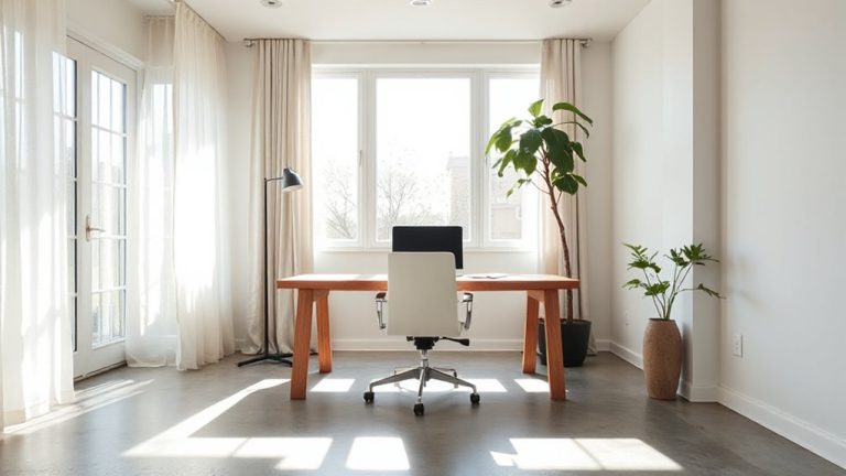
While glare can undermine screen visibility and boost eye fatigue, you’ll find it’s often fixable with simple adjustments to lighting and screen placement. Position your monitor to avoid direct light hitting the surface-tilt or rotate it if needed. Ambient lighting should be soft and diffused, ideally from indirect sources like floor lamps or shaded overhead lights, keeping room brightness around 300–500 lux. Avoid placing your screen opposite or directly under windows and bright fixtures. Matte screens help but aren’t perfect; they scatter reflections better than glossy ones. Good screen positioning-slightly below eye level and about 20–30 inches away-reduces glare and neck strain. No lighting setup eliminates all reflections if screen angle is wrong, and overly dim rooms create contrast strain. Test different arrangements during peak daylight and evening hours. There’s no universal fix, but combining smart ambient lighting with deliberate screen positioning cuts glare markedly in most home offices.
Use Dark Mode and Text Scaling for Comfort
If your eyes feel strained after hours of screen work, switching to dark mode can help-especially in dimly lit rooms-by reducing overall screen brightness and limiting blue light exposure during evening sessions. The dark mode benefits include less glare and improved readability for many, though results vary by screen type; OLED displays deliver deeper blacks and greater comfort, while LCDs may appear washed out. Pair dark mode with text scaling options to increase readability without distorting layout-aim for 120–150% scaling depending on resolution and viewing distance. Keep in mind that dark mode isn’t ideal for bright environments, where low contrast can strain vision. Similarly, excessive text scaling may break webpage layouts or menus. Use system-level controls to adjust these settings consistently across apps. Real-world testing shows these tweaks reduce eye fatigue over long sessions, but personal preference and lighting context should guide your final setup.
Fine-Tune Settings on Your Laptop, Phone, or Monitor
| Setting | Recommended Level |
|---|---|
| Brightness | Match to room light (too high causes glare) |
| Contrast | 70–80% for text clarity |
| Color Temperature | Warmer (2700K–4500K) in low light |
| Blue Light Filter | Enabled after sunset or in dim rooms |
Use built-in tools like Night Shift, f.lux, or Windows Night Light. These shift color temperature and cut blue light, but may alter color accuracy-critical if you edit photos. Calibrate each screen manually; factory presets often over-brighten. Test changes over 2–3 workdays to gauge real impact.
On a final note
You’ll likely reduce eye strain by matching screen brightness to ambient light and boosting contrast for sharper text. Night and dark modes help during long sessions, especially in low light. Position your screen to minimize glare, and adjust text size for comfort. These tweaks work well across laptops, phones, and monitors. But overdoing contrast or dimming too much can blur details, so test settings daily-adjust as needed. Results vary by device and eyesight.