How to Optimize Dual-Monitor Placement for a Data Analyst Using Dashboards
Center your dashboard across both monitors for seamless viewing, using identical models calibrated with tools like SpyderX to prevent visual mismatches. Tilt screens 10°–20° upward to reduce glare and neck strain, especially at eye level where the top of the display aligns with your gaze. Sit 20–30 inches away, angling each monitor 30° inward. Use sturdy monitor arms for precise height and tilt control. Assign your primary screen to dashboards and BI tools, the secondary to queries and docs, and keep reference apps like email off to the side. Matching resolution, minimizing cable clutter, and testing adjustments throughout the day guarantees long-term comfort and accuracy-especially under varying light. You’ll find further refinements naturally follow.
Notable Insights
- Center the dashboard across both monitors for seamless data viewing and reduced eye strain.
- Calibrate both screens to identical color settings using tools like SpyderX for visual consistency.
- Tilt monitors 10°–20° upward to minimize glare and improve ergonomics, especially at standing desks.
- Set monitor height so the top of the screen aligns with eye level to reduce neck strain.
- Position screens 20–30 inches away and angle each 30° inward to create a unified visual workspace.
Place Your Main Dashboard Center for Dual Monitor Setup
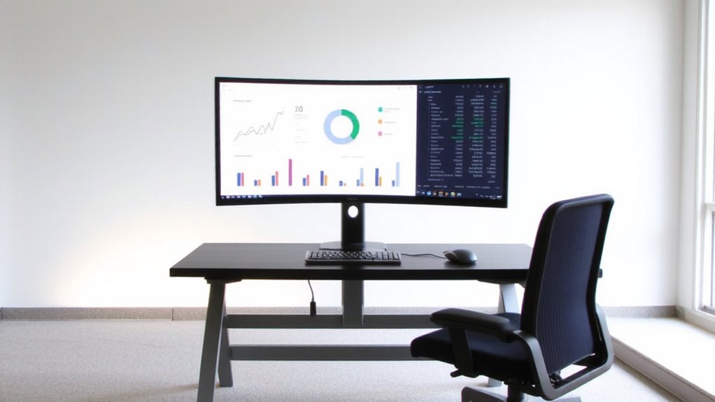
Your main dashboard deserves the spotlight-position it dead center across both monitors for maximum efficiency. Centering improves screen symmetry, reducing eye strain and boosting focus during long analysis sessions. You’ll want identical color calibration on both displays to avoid discrepancies in data visuals-mismatched brightness or white points distort trends. Most IPS panels offer consistent viewing angles, but you’ll still need to manually adjust settings using built-in presets or calibration tools like a SpyderX. While spanning the dashboard across monitors maximizes space, it can complicate fullscreen mode on some software. Also, bezels may break up visuals, especially with dense datasets. Test calibration across different times of day, since ambient light affects perceived contrast. This setup works best with matching monitor models-same size, resolution, and panel type-to maintain uniformity. Don’t assume plug-and-play perfection; manual tuning is almost always needed. For extended analysis sessions, consider pairing your dual-monitor setup with a reclined office chair to support better posture and reduce fatigue.
Tilt Your Screens to Cut Glare and Neck Pain
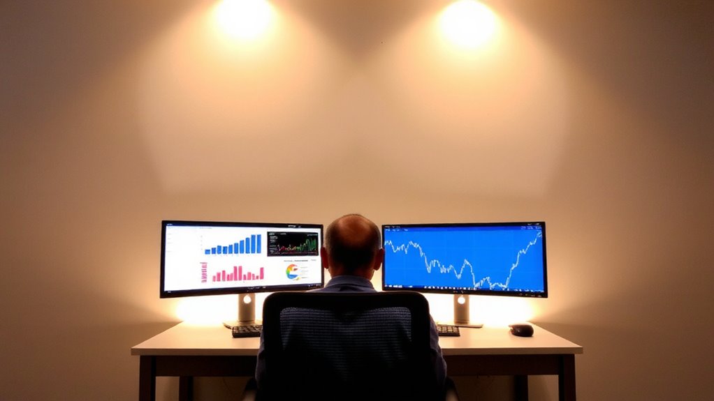
Why do so many data analysts still squint at tilted screens or hunch over glowing displays? You’re not alone-poor tilt adjustment causes glare and neck strain, especially during long dashboard reviews. Tilting your screens 10–20 degrees upward improves viewing angles, reduces reflections from overhead lights, and aligns with natural screen curvature. This small tweak enhances readability and comfort without costly gear.
| Tilt Angle | Effect |
|---|---|
| 0° | Glare from lights, shallow viewing angles |
| 10°–15° | Balanced eye level, reduced neck drop |
| 20° | Ideal for standing desks, accentuates screen curvature |
| >20° | Distortion at edges, especially on flat panels |
Avoid over-tilting-especially on non-curved displays-since extreme angles distort the image. Use built-in stands or VESA mounts to fine-tune. Most quality monitors allow this range; check manufacturer specs for tilt limits and warranty coverage.
Set Monitor Height at Eye Level
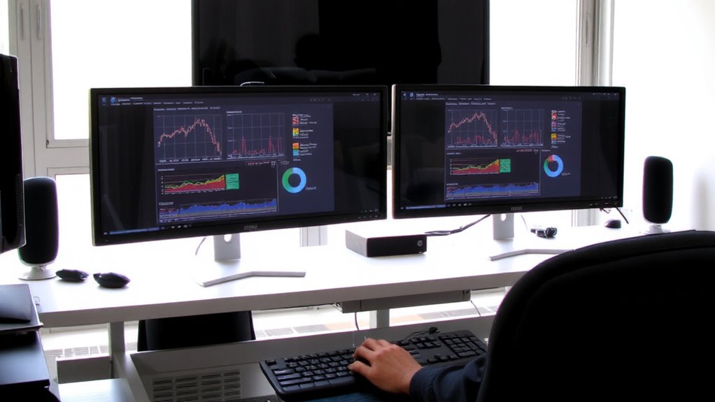
When your monitors sit too high or too low, neck strain creeps in faster than you notice-especially during extended spreadsheet sessions or thorough explorations into visual analytics. You should set monitor height at eye level so the top of the screen aligns with your natural line of sight, reducing constant tilting. This improves posture and supports long-term comfort. Aim for monitor symmetry: both displays at the same height and angle, creating a seamless visual field across dashboards. If using monitor arms, they offer precise height adjustment and help with cable management by concealing power and data cords. Built-in grommets or trays keep connections tidy and accessible. Avoid stacking books or unstable bases-they might shift and cause imbalance. Even with perfect alignment, poor cable management can clutter your desk and disrupt workflow. Test adjustments over a full workday to gauge real-world comfort, not just initial feel. For optimal ergonomics and flexibility, consider investing in one of the best monitor mounts recommended for dual-display setups.
Optimize Dual Monitor Distance for Data Analysis
Proper monitor height sets the foundation for a comfortable workspace, but getting the distance right between dual monitors makes a noticeable difference in how smoothly you move between datasets, charts, and code windows. You should sit about an arm’s length from the center of both screens, roughly 20–30 inches away, to reduce eye strain and support monitor symmetry. Angle each display 30 degrees toward you to create a unified visual field, minimizing head movement. Keep both monitors at matching distances to maintain consistent focus. Clean cable management isn’t just neat-it reduces clutter that can distract during long analysis sessions. Use adhesive clips or sleeves to secure cords without damaging desks. While aligned positioning boosts efficiency, avoid mounting screens too wide apart, which breaks visual flow. Adjustable arms help, but guarantee they’re sturdily rated to prevent sagging over time. A well-organized desk setup can also include a best desk phone stand to keep communication tools within easy reach and maintain a clutter-free workspace.
Zone Screens by Analytics Workflow
While your monitors’ physical setup matters, how you organize content across screens based on your analytics workflow can greatly affect focus and speed. Workflow zoning helps you assign each screen a role, reducing clutter and mental load. Pair this with proper screen alignment to keep your eyes moving naturally between data sources and dashboards.
| Workflow Zone | Recommended Content |
|---|---|
| Primary | Live dashboards, BI tools |
| Secondary | Data queries, documentation |
| Top Zone | Critical KPIs or alerts |
| Reference | Datasets, email, comms |
Keep interactive tools on the main screen and static references on the secondary. This setup works best when both monitors match in size and resolution for seamless alignment. Misaligned screens cause eye strain and slow navigation. While dual 27-inch IPS panels are popular, test different zones with your actual tools-what works for one analyst might not suit another.
On a final note
You should center your main dashboard across both monitors for better focus and workflow. Tilt screens slightly upward to reduce glare and avoid neck strain, and set the top of the display at eye level. Keep monitors about an arm’s length away. Divide tasks between screens based on your analysis steps. Just remember, even with the best setup, frequent breaks are still key to comfort and accuracy.