How Color Psychology Can Enhance Personal Territory Design in Shared Living Spaces
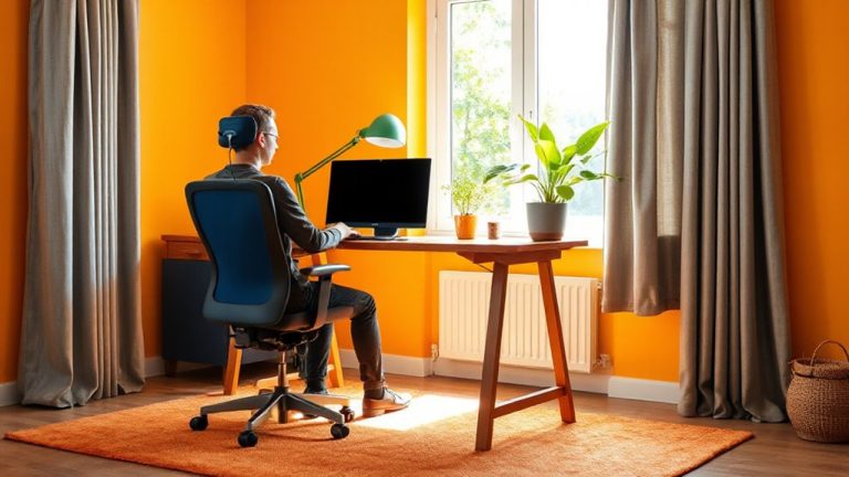
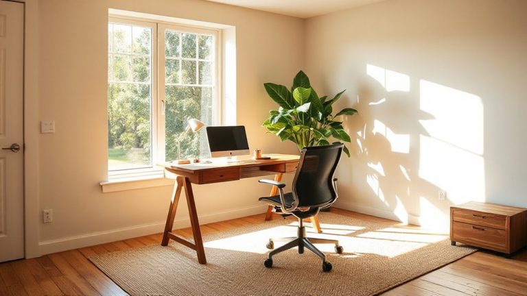
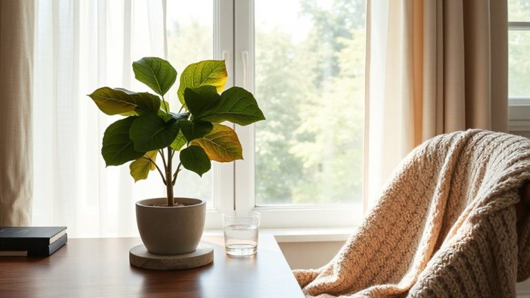
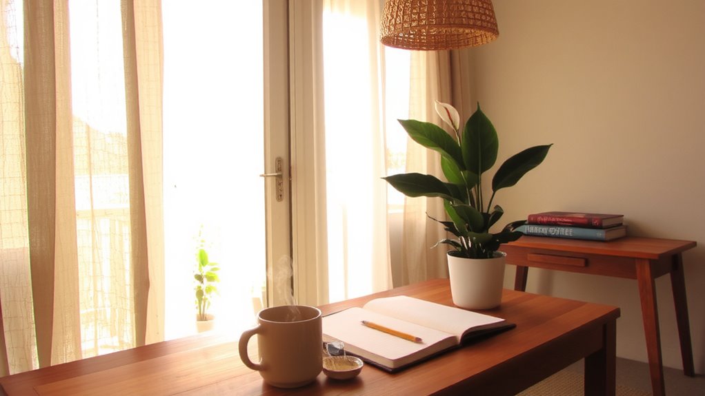
You can define your space in a shared room using color psychology to shape mood and function without permanent changes. Cool blues or soft sage boost focus in work zones, while warm terracotta or muted orange add energy or coziness where you relax. Use matte finishes to cut glare and satin for durability. Keep walls neutral-think warm beiges or soft grays-and personalize with changeable accents like rugs or LED lighting. Test swatches over 48 hours under real light to avoid clashes. Flexibility matters: removable wallpaper or magnetic paint lets you adapt as needs shift. Strong hues work in small doses-overdo it and tension rises. Balance is key for shared calm. Choices like washable, low-sheen paint hide wear while letting you express yourself. Your colors should serve both your habits and housemates’ comfort. Try these strategies to create zones that feel distinctly yours without saying a word. A few tested moves could change how you experience your space altogether.
Notable Insights
- Use cool blues in work zones to boost focus and define productive personal territories.
- Apply warm neutrals in lounging areas to promote relaxation and emotional comfort.
- Assign distinct color palettes like terracotta or sage to differentiate individual zones without visual conflict.
- Maintain harmony by balancing strong hues with neutral bases to support shared calm.
- Incorporate adaptable elements like removable wallpaper or LED lighting to shift mood and function dynamically.
Define Your Space With Color: No Walls Needed
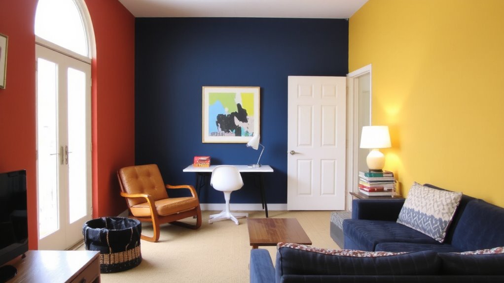
You can define distinct zones in your open-concept home or office without building walls-strategic use of color does the heavy lifting. By applying color harmony, you create a cohesive flow while establishing clear visual boundaries that signal functional shifts, like work to relaxation areas. Paint one zone in cool tones like soft blue to promote focus, another in warm neutrals to encourage lounging-just make certain shifts feel intentional, not jarring. Use matte finishes to reduce glare in workspaces; satin works well in living areas for durability. Test swatches at different times of day-lighting affects perception. While color alone won’t block sound or offer privacy, it’s a low-cost, non-permanent tool that works with furniture and rugs. Avoid overly bold contrasts that can cause visual fatigue. Rely on tried color theories and real-room testing, not just samples on paper, for reliable results.
Use Zones to Separate Styles in Shared Rooms
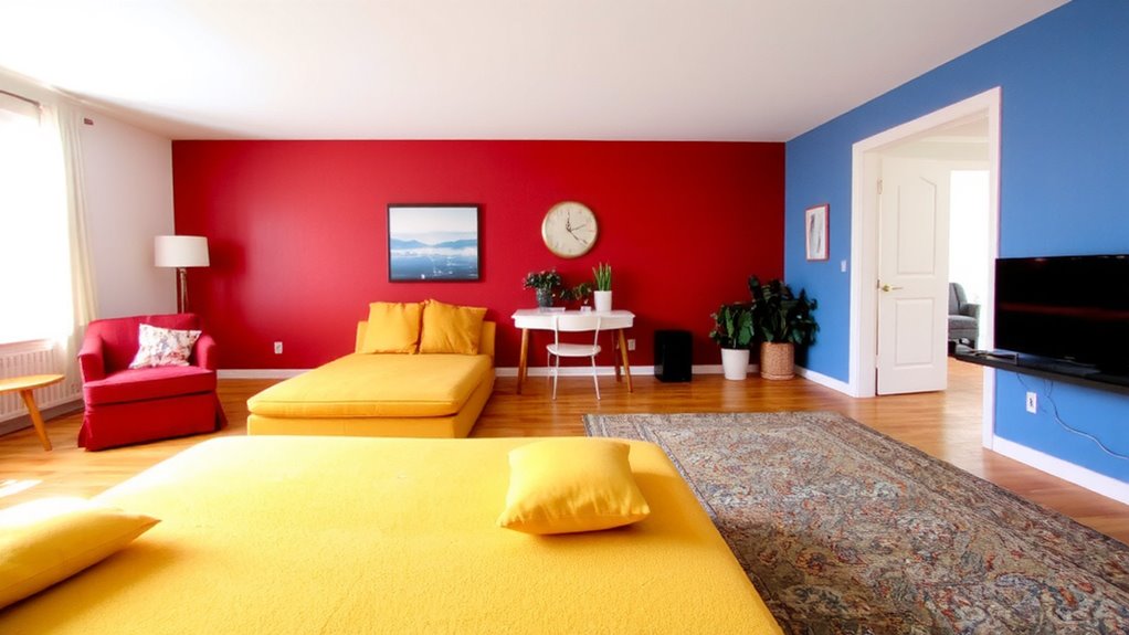
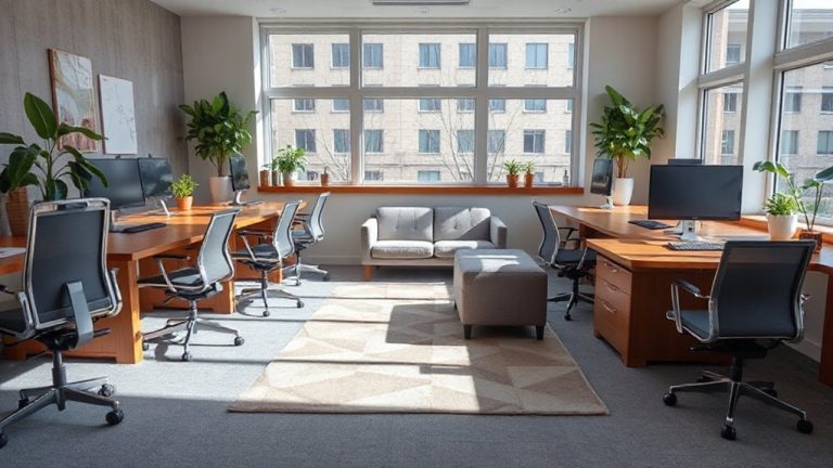
While you can blend styles seamlessly in a shared room, defining zones with distinct color palettes helps maintain visual harmony without sacrificing individuality. You create clear areas where each person’s personality shows, using color to guide the eye and separate functions-like seating or storage-without physical barriers. This approach turns style contrast into a strength, not a conflict. Instead of competing aesthetics, you get intentional variety that supports zone harmony. Paint one wall a warm terracotta for a cozy reading nook while the other side uses soft sage for a calm workspace. Area rugs, shelves, and lighting can reinforce each zone’s identity. Just avoid clashing saturation levels or overcrowding hues, which disrupt cohesion. Test paint samples in natural and artificial light before committing. With thoughtful planning, color becomes a tool for balance, not tension.
Match Colors to Your Vibe and Daily Needs
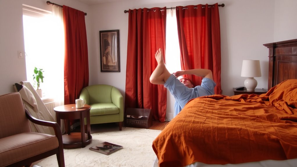
Color choices in shared spaces don’t just reflect personal taste-they shape how you feel and function throughout the day. You can use color harmony to create zones that support your mood and tasks, like cool blues for focus or warm yellows for energy. Think about the emotional resonance of each shade-do you need calm for reading, or vibrancy for creative work? Matching colors to your vibe means aligning pigments with purpose, not just preference. A soft green might help you unwind, while a muted orange could spark morning motivation. But balance is key: strong hues can overwhelm if overused, especially in tight spaces. Test swatches under your actual lighting, since brightness and undertones shift throughout the day. There’s no universal fix-what works in a home office might not suit a shared lounge. Let your needs guide you, and update as they change.
Keep Peace With Shared Neutrals and Personal Pops
Sticking to shared neutrals as a base keeps tension low and flexibility high in any communal space, especially when personal tastes clash. You maintain emotional balance by using soft grays, warm beiges, or muted whites-colors that don’t dominate but support. These tones create shared harmony, giving everyone room to breathe without feeling overwhelmed. Then, introduce personal pops through removable, portable accents like cushions, art, or rugs in bolder hues you love. This way, you express yourself without permanent changes. Just remember: too many strong colors ruin the calm. Keep walls and large furniture neutral to preserve peace. Test swatches in natural and artificial light before committing. Use washable paints with matte finishes to reduce glare and hide imperfections. Balance isn’t about sameness-it’s about respect, clarity, and smart boundaries that let personalities coexist without conflict.
Make Your Room Feel Like You (Without Clashing)
Since your space should reflect who you are without stepping on anyone else’s style, start by anchoring the room in a cohesive base that blends with shared areas-think soft grays or warm beiges on walls and large furniture. Then, make it yours through texture contrast-add a nubby throw, a smooth wood desk, or a woven rug to create depth without color clashes. Use lighting contrast to shift the mood: pair overhead lights with a warm desk lamp or a cool LED strip behind the bed frame. This adds dimension and supports different activities. A well-chosen top desk lamps can enhance both functionality and ambiance in your personal zone. These subtle layering tricks keep the space feeling personal but not chaotic. Just avoid anything permanent or loud-like bold paint or oversized posters-that might bother your roommate or reduce resale value. Small, reversible changes give you identity without conflict. You’re not just decorating-you’re balancing self-expression with shared comfort, one textured pillow or shaded lamp at a time.
Adjust Colors as Your Mood: and Roommate: Changes
How often do your surroundings actually keep up with how you’re feeling-or whether your roommate just repainted the accent wall without asking? With color adaptation, you can maintain emotional resonance in shared spaces without constant conflict. Soft hues like sage or warm gray shift well across moods and lighting, making them ideal base tones. Add changeable elements-magnetic paint sections, removable wallpaper panels, or LED strip lighting-so you can adjust without damaging walls. These let you respond to stress, energy levels, or seasonal shifts while respecting shared agreements. But even flexible solutions have limits: adhesive wear, color fading under LEDs, and conflicting roommate schedules can reduce effectiveness. Always test samples under real lighting for at least 48 hours and confirm lease terms before installing. While not a fix-all, strategic color adaptation helps balance personal needs with shared stability-when done thoughtfully.
On a final note
You can define your personal space in shared living areas with color-no walls needed. Paint, textiles, or furniture in your preferred tones carve out identity and support daily moods. Use shared neutrals as a base, then add bold accents that reflect your style, avoiding visual clash. Just guarantee changes are reversible and agreed upon-respect shared agreements as much as personal expression. Colors shift feelings, but good communication keeps harmony.