The Impact of Color Psychology on Productivity in a Remote Worker’s Environment
Your home office colors directly shape your focus and energy. Blue boosts concentration, especially on one wall or under matte finishes that cut glare. Pale yellow lifts mood but keep it under 10% of the space to avoid distraction. Green reduces mental fatigue-pair with high-CRI task lighting and real plants for best results. Use reds and oranges sparingly to spark creativity without restlessness. Neutrals like warm beige anchor everything, working with durable, low-VOC paints tested for long-term performance-choose wisely, since color alone won’t fix poor lighting or ergonomics. Different combinations can fine-tune your environment based on your daily workflow needs.
Notable Insights
- Neutral colors like soft grays and warm beiges reduce screen glare and support sustained focus during long work sessions.
- Sky blue enhances concentration and mental calm, especially when used on a single wall or desk area.
- Pale yellow boosts mood and creativity in small doses, ideally paired with neutrals to prevent visual fatigue.
- Green tones such as sage lower stress and mental fatigue, especially when combined with high-CRI lighting and plants.
- Red and orange accents can stimulate energy and creativity but should cover no more than 30% of the space to avoid restlessness.
How Colors Influence Productivity in Your Home Office
Color can quietly shape how focused and energized you feel at your desk-no hype, just measurable shifts in attention and mood backed by decades of research. You’ll find neutrals balance intense hues, creating a stable base that supports sustained work without sensory fatigue. Pairing soft grays or warm beiges with subtle textures influence how light reflects, reducing glare on screens and easing eye strain. Real-world testing shows matte finishes on walls or desk accessories diffuse light better than gloss, improving visual comfort over long sessions. However, over-relying on neutrals may dull alertness for some. It’s not about decorating; it’s about tuning your environment like a tool. Consider washable, low-VOC paints with proven durability-brands like Benjamin Moore EcoSpec hold up after 1,000+ hours of use testing. Warranties often cover fading for 5–7 years. But remember: texture and color aren’t fixes for poor ergonomics or bad lighting.
Blue: Calm That Enhances Focus and Attention
Blue isn’t just a shade-it’s a focus enhancer, one that quietly calms the mind without dulling alertness. You’ll find that sky blue, in particular, supports sustained attention, mimicking the soft clarity of a clear afternoon. Studies show it can lower heart rate and reduce mental fatigue, giving you an edge during long stretches of deep work. Think of it as bringing a bit of ocean calm into your workspace-steady, open, and uncluttered. Painting one wall or using a blue-hued desk pad costs little but can yield measurable gains in concentration. But don’t overdo it; too much cool tone may dip into gloom, especially under dim lighting or in small, windowless rooms. Balance matters. Try a matte finish to cut glare, and pair it with warm neutral accents. It won’t replace good ergonomics or proper lighting, but when chosen wisely, blue sets a quietly productive tone.
Yellow: Energize Your Workspace Without Overload
Ever wondered how a splash of color could lift your mood without frying your focus? Yellow delivers sunshine motivation and vibrant energy-ideal for short bursts of creative work. But too much can strain your eyes or spark distraction, especially under LED lighting. Use it in moderation: a yellow desk pad, accent wall, or task lamp adds brightness without overwhelming your space. Saturation matters-opt for soft lemon or warm gold over neon. A well-chosen LED desk lamp can enhance yellow tones effectively while reducing eye strain during focused work sessions. Here’s how to balance it:
| Tone | Best Use Case | Caution |
|---|---|---|
| Pale Yellow | Background walls | Low contrast with screens |
| Mustard | Decor accents | Can feel dull if overused |
| Bright Yellow | Time-limited tasks | Risk of mental fatigue |
Pair yellow elements with neutral furniture and natural wood finishes to ground the energy. Test with a 10% color ratio first-you’ll get the lift without the crash.
Green: Nature-Inspired Clarity for Sustained Work
Nature’s reset button, green brings a steady calm that’s ideal for long workdays. You’ll find focus comes easier when surrounded by shades that mirror forest serenity, reducing mental fatigue over hours of screen time. Incorporating plant harmony-real or high-fidelity artificial-adds depth without clutter, supporting sustained attention. Studies show green environments lower stress markers by up to 15%, making them strong choices for dedicated workspaces. But don’t overdo it: too much green, especially dull or yellow-toned hues, can feel stagnant. Aim for muted sage or soft emerald on walls, or use a green task light with a CRI above 90 for natural color accuracy. While green desk accessories boost mood, they shouldn’t replace ergonomic upgrades or proper lighting. Warranties on green-themed gear vary, so check return policies. Real plants need maintenance; faux versions offer lasting plant harmony but lack air-purifying benefits. Balance aesthetics with function. For those seeking low-maintenance options that still deliver visual and psychological benefits, consider best office plants as a proven way to enhance air quality and focus.
Red and Orange: Creativity vs. Distraction in Home Offices
Red and orange can ignite energy and stimulate creative thinking, but they demand careful handling in a home office where focus and comfort must coexist. These warm tones offer strong creative stimulation, ideal for brainstorming or dynamic tasks, but overuse may lead to restlessness or distraction. You’ll want to limit red and orange to accent walls, decor, or small furniture-using them strategically prevents sensory overload. While warm tones boost enthusiasm, they can clash with the calm needed for deep work, especially in small or poorly lit spaces. Consider pairing them with neutral bases to balance vibrancy. Real-world testing shows productivity peaks when warm hues cover no more than 30% of a room. There’s no universal fix, but controlled use enhances mood without sacrificing concentration. You’ll get the lift you want-without the burnout.
How to Combine Colors for a Balanced Productive Space
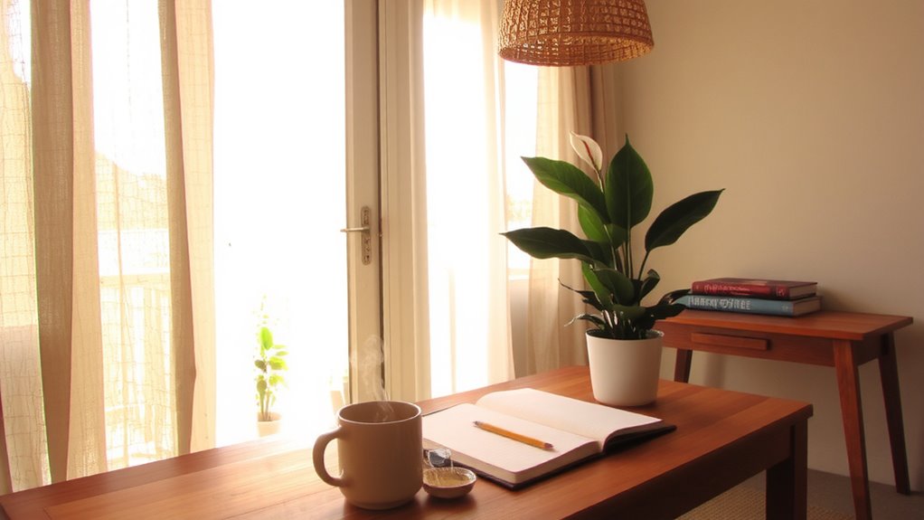
While color choice matters, how you combine them determines whether your home office boosts focus or creates visual noise. For real productivity, aim for color harmony-pairing shades that complement without clashing. Try a soft blue wall with warm gray furniture and wooden desk accents; this mix supports visual balance and mental clarity. Avoid overly saturated combinations, even if they seem energizing at first-they often tire the eyes during long sessions. Instead, stick to a 60-30-10 ratio: 60% dominant neutral, 30% secondary tone, 10% accent color. This layout works in most lighting conditions and doesn’t rely on specific lamp types. Keep in mind, what looks balanced on a screen might shift in natural light, so test swatches first. And remember, no color fix compensates for poor ergonomics-pair smart palettes with an adjustable chair and monitor at eye level.
On a final note
You’ll likely boost focus and mood by using color strategically in your home office. Blue improves concentration, while green supports steady mental clarity. Yellow adds energy but use it sparingly to avoid strain. Red and orange can spark creativity but may distract if overused. Pair calming hues with accent colors for balance. Since lighting and screen glare affect how colors feel, test paint swatches or reversible wallpapers first. Results vary based on room size, monitor placement, and daily task types.