Strategies for Minimizing Visual Distractions Using Color Psychology in Home Offices
Paint your home office in soft blues or muted greens to reduce mental fatigue and sharpen focus-studies show these cool tones support clarity, but avoid saturated shades that cause visual strain. Stick to warm grays, beiges, or soft whites for low-contrast, calming backdrops. Steer clear of neon hues and bold patterns that trigger overstimulation. Use navy or sage accents in low-sheen finishes to sustain attention without glare. Pair matte walls with 5000K full-spectrum lighting for true color balance-get this right, and you’ll see how small changes can meaningfully shape your focus.
Notable Insights
- Use soft blues and muted greens to reduce stress and enhance mental clarity without overstimulation.
- Choose warm grays, beiges, or soft whites to create a low-contrast, distraction-free workspace.
- Avoid neon yellow, electric blue, and fiery red, as they trigger overstimulation and disrupt focus.
- Incorporate navy or sage accents in matte finishes to sustain attention and reduce eye strain.
- Pair cool-toned walls with 5000K full-spectrum lighting to maintain balanced color perception and minimize glare.
Use Colors That Boost Focus in Your Home Office
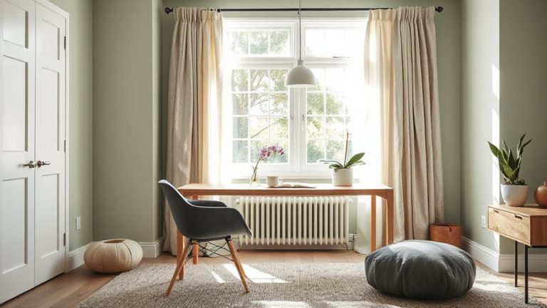
If you’re aiming to maximize concentration in your home office, cool tones like soft blues and muted greens are your best bet, as they’ve consistently shown in environmental psychology studies to lower stress and reduce mental fatigue. These colors support mental clarity by promoting steady focus without overstimulation. When you pair them intentionally, you create color harmony that guides the eye smoothly across your workspace, reducing visual strain during long tasks. Paint brands like Benjamin Moore’s Aura or Sherwin-Williams’ Emerald offer durable, low-VOC finishes with high scrub resistance-ideal for maintaining appearance over time. However, avoid overly saturated shades, as they can backfire and increase distraction. Natural light affects how these hues render, so test samples at different times of day. Balance is key: effective focus-boosting color isn’t a standalone fix, but a strategic support for sustained attention when aligned with good lighting and ergonomic design.
Choose Calming Neutrals for Less Distraction
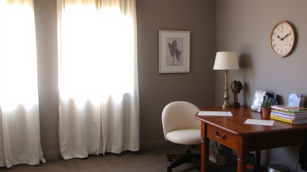
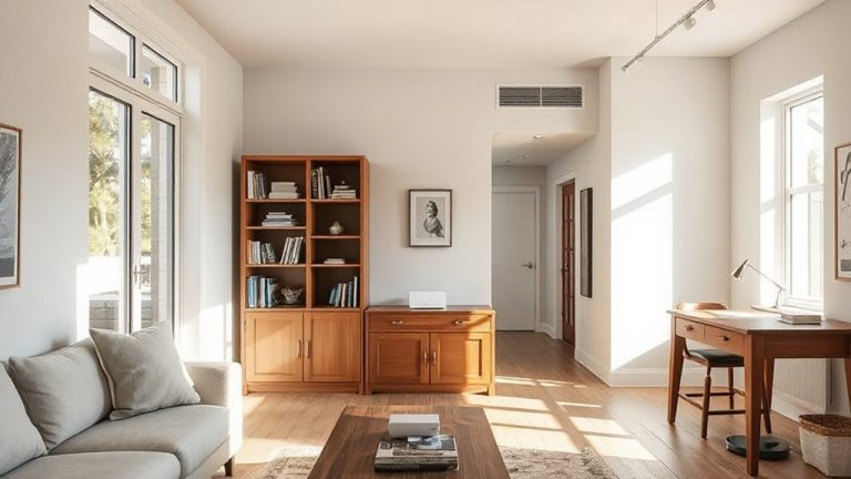
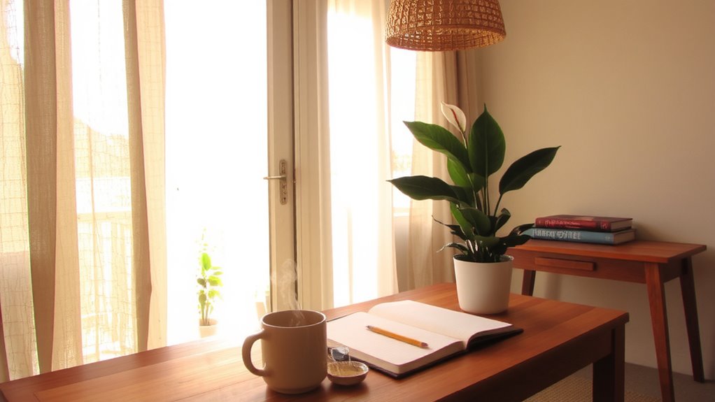
While bold hues may energize certain spaces, you’re better off with calming neutrals like warm gray, beige, or soft white when minimizing visual distraction in your home office. These tones create a stable, low-contrast environment that supports sustained focus without sensory fatigue. Pair them with soft textures-think wool rugs or linen curtains-and natural materials like oak, bamboo, or cork to add subtle depth without visual noise. These elements enhance comfort and reduce glare, especially under LED or overhead lighting. However, too much neutral tones can feel sterile or dim, particularly in small rooms with limited natural light. To offset this, use accent lighting and varied surface finishes rather than bold color. Matte finishes on walls and matte-finished wood desktops reduce reflections. Test paint samples under your actual work lighting before committing. Balance is key-aim for cohesion, not emptiness.
Avoid Distracting Colors That Break Concentration
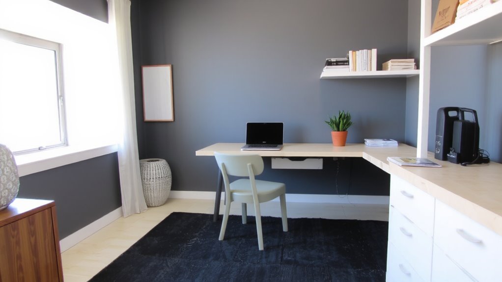
Because bright, saturated hues grab attention by design, you’ll want to steer clear of paints or decor in neon yellow, electric blue, or fiery red if staying focused is your goal. These colors create vivid contrasts and activate areas of the brain linked to alertness, which can backfire by overstimulating your workspace. Similarly, avoid bright patterns on curtains, rugs, or chair fabrics-they introduce visual noise that pulls your attention away from tasks. While bold color blocking might look dynamic in design magazines, real-world use shows it often hampers sustained concentration. Neutral backgrounds reduce cognitive load, giving you more mental bandwidth for actual work. That said, completely sterile spaces can feel dull, so balance is key. You don’t need a blank white room, but limit high-impact colors to small, intentional choices-like organizers or pens-where they won’t dominate your field of view.
Add Focus-Boosting Accents Like Blue or Green
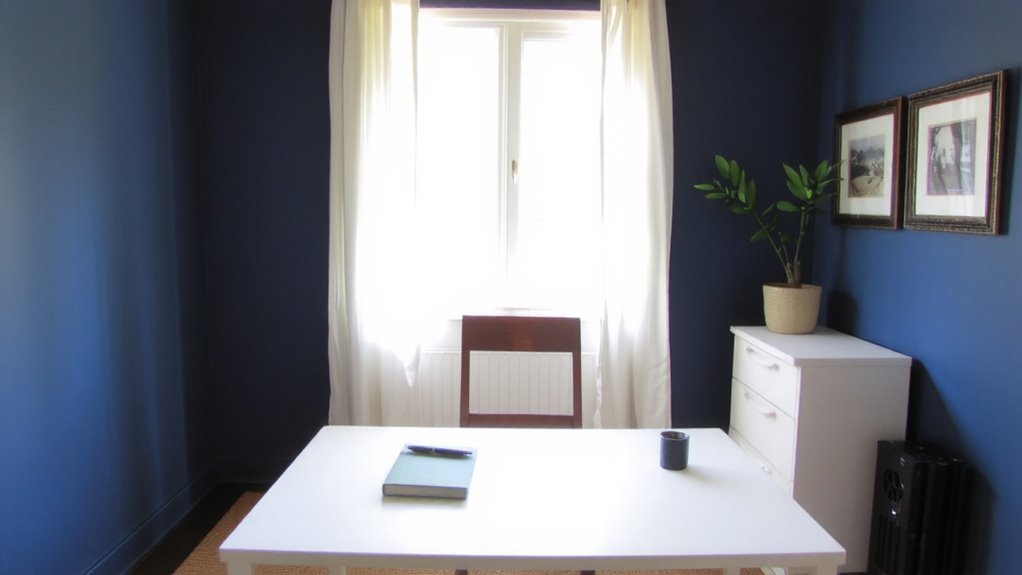
Color can be your ally when it comes to focus-especially calming blues and grounded greens. You’ll find that blue accents, like a navy desk mat or cobalt framed art, help sustain attention during deep work sessions. Studies show these shades reduce mental fatigue, making them reliable for long tasks. Green tones, such as sage or forest, also promote balance and visual comfort, reducing eye strain if you’re staring at screens for hours. Practical options include paint swatches with low sheen or fabric accessories in muted saturation to avoid glare. While both color families support concentration, avoid overly bright versions-they can become distractions. Also, monitor lighting: cool whites can make blue accents feel sterile, while warm LEDs soften green tones effectively. There’s no universal “best” shade, so test small changes first. Results vary by room size and window direction, so give each tweak a full workweek before deciding.
Match Your Colors to Your Work Type
If your work leans heavily into analytical or detail-oriented tasks, cool tones like slate blue or soft gray-green can support sustained focus without dulling mental agility. For creative roles, warmer hues-think terracotta or muted gold-can encourage openness and idea flow, but they risk overstimulation if not balanced. Success hinges on color harmony and task alignment: your palette should complement both your mental mode and environment. A designer might thrive with earthy accents, while an accountant may prefer neutral backgrounds with subtle blue-gray walls. Avoid bold contrasts that pull attention; instead, layer tones within the same family for cohesion. Test samples under your actual lighting, as paint swatches can shift dramatically. Remember, personal preference matters-what works in studies might not suit your space. Balance theory with trial, and adjust based on daily performance, not trend-driven choices.
Optimize Lighting and Surfaces for True Color Impact
While paint color matters, your lighting and wall surface play just as big a role in how a shade actually looks and feels throughout the workday-so don’t overlook them. The light quality in your space directly affects color perception; natural daylight reveals truer tones, while cool LED bulbs can make warm hues look flat. You’ll want consistent, diffused lighting to minimize glare and shadows. Surface reflectivity also changes outcomes-glossy finishes amplify light, boosting brightness but possibly causing distractions, especially near screens. Matte finishes absorb light, reducing glare but potentially dulling color vibrancy. For balanced results, use a satin finish and pair it with adjustable, full-spectrum bulbs around 5000K. Test samples at different times of day, since morning and afternoon light alters color appearance. There’s no universal fix-your room’s orientation, window size, and existing fixtures all influence the final effect. Adjust accordingly. When selecting seating, consider the design and comfort level of a perch seat to maintain focus and reduce physical distractions.
On a final note
You’ll boost focus by using calming neutrals and strategic blue or green accents. These colors help reduce visual distraction and support sustained concentration. But lighting matters-natural light reveals true tones, while LED panels may shift hues slightly. Matte finishes cut glare, unlike glossy surfaces. Test swatches in your actual space before painting. Results vary by individual, so personalize based on your tasks and light setup.