Using Color Psychology to Create a Relaxing Home Office Atmosphere That Reduces Decision Fatigue
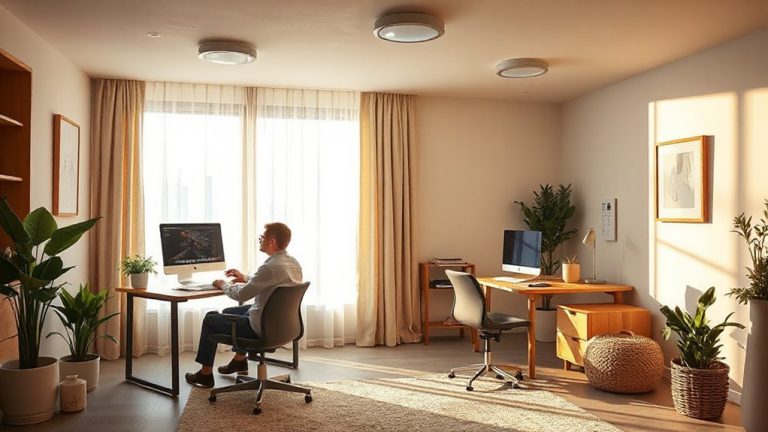
Use soft blues or muted greens for your home office-they reduce mental strain and decision fatigue by mimicking calming natural environments. These cool tones support focus without overstimulating, especially when paired with matte finishes that cut screen glare. Avoid bright reds or neon yellows, which increase eye fatigue and emotional arousal. Pair your walls with neutral grays or warm wood tones to maintain visual balance. Lighting matters: test shades under both daylight (5000K) and warm evening bulbs (2700K), since colors shift dramatically across the day-what looks calm at noon may feel dull by dusk.
Notable Insights
- Soft blues and muted greens promote calm and focus, reducing mental strain during prolonged decision-making tasks.
- Pair cool, natural tones with warm wood finishes or neutral walls to create visual balance and grounding.
- Avoid saturated reds, oranges, and neons that trigger emotional arousal and increase visual fatigue over time.
- Use matte paint finishes to minimize screen glare and support eye comfort under both natural and artificial light.
- Test colors under varying light conditions using full-spectrum bulbs (CRI 90+) to ensure consistent, calming effects throughout the day.
Best Calming Colors for Your Home Office
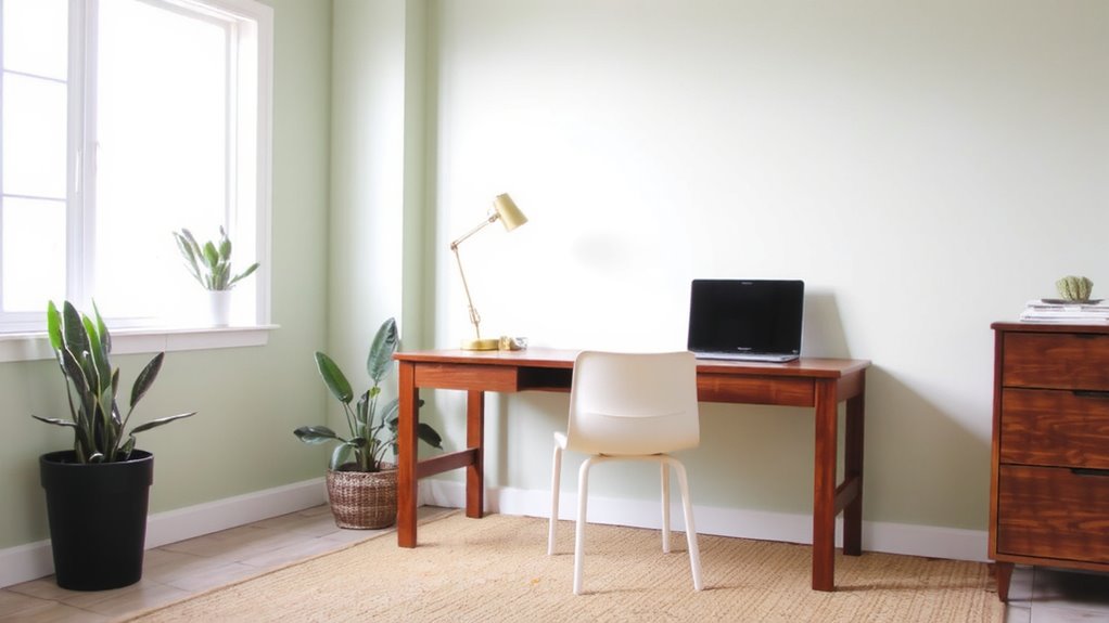
Color sets the tone before you even sit down to work. For a calming home office, soft blues and muted greens are your best bets-they promote color harmony and support visual balance without dulling alertness. These shades mimic natural environments, reducing mental strain over long sessions. Pair them with neutral walls or warm wood finishes to keep the space grounded. While cool tones dominate for relaxation, avoid overly saturated versions-they can disrupt focus. Matte finishes help reduce glare, especially near screens, and have tested well in independent light-diffusion studies. However, paint quality matters: cheaper options often need extra coats and fade faster, even with UV protection. Look for brands with 70%+ hiding power and at least a 5-year fade warranty. You’ll save time and touch-ups. Remember, lighting alters how colors appear-test swatches at different times of day. What looks serene at noon might feel cold at dusk.
How Home Office Colors Affect Focus and Energy
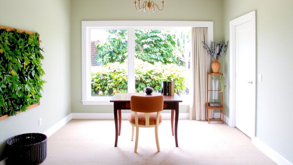
Your brain responds to color like it’s processing a signal-some hues sharpen attention, while others drain momentum. Cooler color temperatures, like soft blues and muted greens, support sustained focus by reducing visual stress and balancing light wavelengths. These tones align well with natural daylight, helping regulate alertness without overstimulation. Warmer colors can boost energy, but only in moderation-too much red or orange may increase mental fatigue over time. High visual contrast between walls, desks, and screens improves task clarity, making it easier to shift attention efficiently. However, excessive contrast-like black text on white with reflective surfaces-can cause glare and eye strain. Pair matte finishes with balanced ambient lighting to reduce harsh reflections. While color alone won’t transform productivity, thoughtful combinations of color temperature and visual contrast can fine-tune your focus throughout the workday.
Worst Colors for Focus (And What to Avoid)
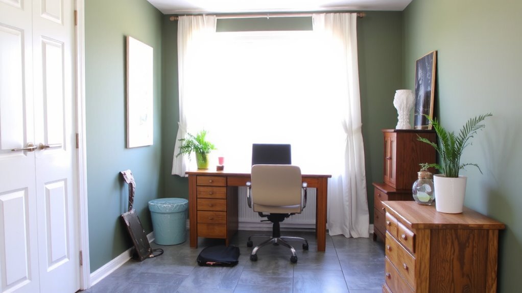
While they might seem energizing at first glance, vibrant reds and intensely saturated oranges can actually undermine your concentration over time. These distracting hues trigger emotional arousal, making it harder to sustain focus during long tasks. Overwhelming tones like neon greens or electric yellows may feel playful but often cause visual fatigue, especially under LED or natural light. They create glare and reduce contrast on screens, leading to eye strain. Even bold purples or deeply saturated blues-while calming in theory-can feel heavy if not balanced with neutral backgrounds. Avoid large swaths of such colors on walls or major furniture. Instead, use them sparingly as accents if you must. Soft, muted neutrals generally support better cognitive performance. There’s a reason most productivity-focused workspaces lean on grays, warm whites, or gentle beiges-they minimize distraction without sacrificing warmth. Test paint samples under your actual lighting before committing.
Pick Office Colors for Your Job Type and Hours
If you’re working long hours on tasks that demand deep focus, cooler tones like soft grays or muted blue-greens often perform best-they’re proven to reduce eye strain and support sustained attention, especially under the glare of overhead LEDs or sunlight. Your job specific hues should match both your work type and schedule. Time based tones help align your space with natural energy shifts-darker in the morning, lighter by late afternoon. Consider these combinations:
| Job Type | Job Specific Hues | Time Based Tones |
|---|---|---|
| Creative | Muted terracotta | Morning: Warm accent |
| Analytical | Cool gray-blue | Afternoon: Soft light |
| Flexible hours | Sage green | All-day: Balanced tint |
Paint sheens matter too-matte reduces glare, while eggshell offers cleanability. These choices aren’t one-size-fits-all; test swatches under your actual lighting.
Accent Colors for Focus and Calm
Though accent colors might seem like a minor detail, they can meaningfully influence focus and calm when chosen with intent. You’ll want to pick accent hues that support concentration without overwhelming your space-think muted blues or soft greens, which testing shows can reduce mental strain during long work sessions. These shades work best when they contribute to overall color balance, complementing neutral walls and functional furniture rather than distracting from them. A pop of warm terracotta or deep slate in a throw pillow, frame, or storage bin can ground the room and guide your attention. Just remember: too many accent hues create visual noise, increasing decision fatigue instead of reducing it. Stick to one or two secondary tones, covering no more than 10–15% of your walls or decor. Real-world use shows this ratio maintains clarity and calm without sacrificing visual interest.
How Lighting Changes Office Colors
How does the same paint color look completely different at 9 a.m. versus 7 p.m.? Because light temperature shifts throughout the day, altering how your office walls appear. Morning light tends to be cooler, around 5000K, making blues and greens feel crisp but possibly stark. By evening, warm indoor lighting-often 2700K to 3000K-can mute those same tones or enhance warmer hues like beige or terracotta. This is where color rendering matters. Lights with a high CRI (Color Rendering Index) of 90+ reveal truer pigment, so your chosen shade stays consistent. But cheaper LEDs with poor color rendering can distort colors, adding unwanted yellow or gray casts. Relying solely on daylight isn’t enough-you need balanced, full-spectrum bulbs. Test room appearance at different times and with varied bulbs to avoid surprises. For optimal results, consider a best home office lighting setup that combines task, ambient, and accent lighting to maintain color accuracy and reduce eye strain.
Try Home Office Colors Before You Commit
Choosing the right paint color isn’t a decision to make based on a tiny swatch or a digital render alone-especially when lighting conditions can shift the way a shade reads throughout the day. For color precision, rely on sample testing with large peel-and-stick panels or painted poster boards placed on multiple walls. View them at different times-morning, noon, and evening-to see how natural and artificial light affect warmth and intensity. This method reveals subtle undertones that small swatches miss. Keep in mind: finishes like matte or eggshell alter perception, so match your planned sheen during testing. While sample kits aren’t perfect, they reduce costly mistakes and support better design choices. Though it takes a few extra days, this step can prevent repainting later-saving time, money, and stress. Commit only after real-world observation.
On a final note
Choose calming colors like soft blues and warm grays to support focus and reduce decision fatigue. These shades work well under LED or natural light and pair reliably with matte paint finishes. But test samples first-lighting changes color appearance dramatically. While neutral palettes suit most jobs, creative roles might need subtle accents. Remember, long-term comfort depends on balance: calm tones help, but ergonomics and glare control matter just as much. No color replaces proper desk height or screen positioning.