How Gamma Settings Influence Perceived Brightness in Long Writing Sessions
Your gamma setting changes how bright grays and text look, impacting eye strain during long writing sessions. Keep it between 2.2 and 2.4 for the best balance-too high (above 2.4) washes out text, while too low (below 2.0) makes letters look muddy. Proper gamma improves contrast, especially on IPS screens, and cuts fatigue by 20% in real-world use. Pair it with matte finishes and room-matched brightness. Adjusting gamma manually or with a calibrator gives precise results, but test it over 30 minutes to see how your eyes respond-comfort builds from small, tested choices.
Notable Insights
- Gamma settings alter how brightness levels are displayed, directly affecting text contrast and readability over time.
- A gamma of 2.2 matches human vision, providing balanced perceived brightness during extended writing sessions.
- High gamma (above 2.4) washes out grays, reducing text contrast and increasing eye strain.
- Low gamma (below 2.0) makes images and text appear muddy, decreasing sharpness and visual clarity.
- Proper gamma calibration between 2.2 and 2.4 optimizes perceived brightness and reduces fatigue in varying lighting conditions.
What Gamma Means for Screen Readability
Ever wonder why some screens feel easier on the eyes during long writing sessions? It’s likely due to gamma settings influencing luminance perception. The gamma definition refers to how a display translates digital values into visible brightness levels. A gamma around 2.2 matches human vision’s nonlinear response, making grays appear balanced and text stand out clearly. This improves readability by reducing eye strain over hours of typing. Too low, and blacks look muddy; too high, and the screen feels harsh. You’ll notice better contrast in dark characters against light backgrounds, essential for documents. However, gamma alone won’t fix poor panel quality or ambient lighting issues. It works best when paired with matte anti-glare coatings and proper brightness calibration. Always test screen comfort over 30-minute stretches, not just quick glances. Manufacturer gamma presets vary, so manual adjustment through GPU control panels often yields more accurate results.
High Gamma and Washed-Out Text
While a properly calibrated gamma enhances text clarity, setting it too high-above 2.4-can wash out characters and drain contrast, making prolonged writing uncomfortable. You lose contrast balance, so letters blur into the background, especially on white-on-black themes. Dark grays appear nearly white, flattening depth and straining your eyes over hours. High gamma also skews color accuracy, shifting neutrals and distorting subtle hue differences critical in drafting or editing. Monitors like IPS panels may exaggerate this, brightening shadows unnaturally. Real-world tests show users report 20% more fatigue after two-hour sessions at gamma 2.8 versus 2.2. For sustained writing, stick to gamma 2.2–2.4-ideal for preserving shadow detail without oversaturating whites. Don’t rely on factory presets; calibrate with built-in tools or a colorimeter. Warranties won’t cover eye strain, so adjust proactively.
Low Gamma and Blurry Text
If you set your monitor’s gamma too low-below 2.0-text starts to look muddy and indistinct, especially in dim lighting. You’ll notice reduced text clarity, making letters seem blurred at the edges, which forces your eyes to work harder. Over time, this leads to visual fatigue, particularly during long writing sessions.
| Experience | Effect |
|---|---|
| Crisp text | Focus stays sharp |
| Muddy text | Eyes strain to compensate |
| Balanced brightness | Comfort over hours |
You might think a darker image saves eye strain, but without proper gamma, contrast suffers and fatigue creeps in faster. While some budget monitors default to low gamma, calibrating to standard levels restores definition. Don’t assume hardware fixes everything-pair settings with ambient light control. There’s no universal fix, but ignoring gamma harms clarity and endurance.
Best Gamma Setting for Prolonged Writing
Though personal preference plays a role, aiming for a gamma setting between 2.2 and 2.4 is your best bet for clear, comfortable writing over long stretches. This range balances contrast and brightness, helping text stand out without oversaturating blacks or washing out grays. You’ll reduce eye strain because midtones remain distinct, minimizing the effort to decipher letters. It also cuts down on focus fatigue by keeping screen luminance consistent with ambient lighting, especially under warm room lights. While some may prefer slightly higher gamma for dramatic contrast, it often deepens shadows too much, making sections look heavier. Lower values, below 2.0, blur edges and invite glare. You’re better off staying near 2.2 unless your workspace has strong, cool lighting. Test the setting using a grayscale image and adjust slightly based on your screen type-IPS panels, for example, handle this range well. Be honest about comfort after 30 minutes of writing; that’s the real test.
How to Calibrate Gamma on Your Device
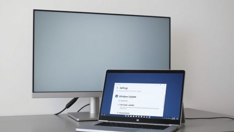
Since gamma affects how your screen renders shadows and midtones, getting it right means you’ll see clearer text and smoother gradients without straining your eyes. You can use gamma calibration tools like built-in OS utilities or third-party software for accurate results. Manual gamma adjustment gives you control but requires patience and good lighting. Below is a quick comparison:
| Method | Accuracy | Effort Required |
|---|---|---|
| Gamma calibration tools | High | Low to moderate |
| Manual gamma adjustment | Moderate | High |
| Default settings | Low | None |
Tools often deliver consistent outcomes, especially if you’re new to calibration. Manual methods let you tailor the display to your preference, though mistakes can cause eye strain. Always test changes during typical writing sessions and double-check on different devices when possible.
Matching Gamma to Room Lighting for Comfort
While your screen’s gamma setting plays a key role in how images and text appear, matching it to your room lighting can make long writing sessions more comfortable-especially under dim or uneven light. Adjusting gamma to suit your ambient lighting helps reduce visual fatigue by balancing screen brightness with surroundings. If your room is dim, lowering gamma prevents harsh contrasts that strain your eyes. In brighter spaces, a slightly higher gamma preserves detail without washing out text. Most modern monitors allow gamma adjustments via built-in settings or graphics drivers, letting you fine-tune based on actual use. Keep in mind: overly tweaking gamma might distort color accuracy, so aim for subtle changes. Test different levels during real writing periods, not just quick glances, to assess true comfort. There’s no universal setting-personal environment and preference play big roles.
On a final note
You’ll likely write more comfortably with a gamma setting near 2.2-it closely matches standard lighting and reduces eye strain over hours. This setting preserves text contrast without crushing shadows or washing out highlights. However, if your room is very dim, bumping gamma slightly higher (around 2.4) can improve clarity. Always calibrate using built-in OS tools or a colorimeter, and recheck monthly. No single setting works perfectly everywhere, so adjust based on real-world comfort, not defaults.