Exploring Nano-IPS Advantages Over Standard Panels for Illustrator Freelancers
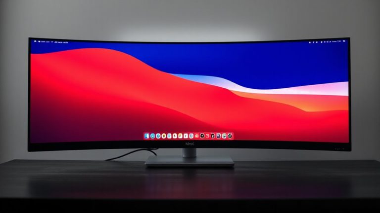
You’ll get truer colors and fewer client revisions with a Nano-IPS monitor-many hit under 2 deltaE right out of the box, matching final output with near-perfect accuracy. Quantum-enhanced subpixels cover over 98% of DCI-P3 for richer reds, greens, and blues, while wide 178° viewing angles prevent color shift during critiques. Crisp 5ms response times eliminate blur in fast pans, though some models show slight overshoot. Factory calibration helps, but periodic tuning is needed. Glossy screens may glare, and entry models can have edge glow. Top picks include 3-year warranties-knowing what to look for makes all the difference.
Notable Insights
- Nano-IPS panels offer superior color accuracy with Delta E <2, ensuring illustrations match final output closely.
- They cover over 98% of DCI-P3 and up to 135% sRGB, delivering richer, more vibrant colors than standard panels.
- Color consistency remains high across wide 178° viewing angles, ideal for collaborative client reviews and precise editing.
- Enhanced image clarity and 5ms or lower response times ensure sharp details and smooth performance during fast on-screen movements.
- High color fidelity reduces client revision rounds by up to 40%, improving workflow efficiency and project turnaround.
What Is Nano-IPS and Why It Matters for Illustrators
Picture crisp colors, sharp lines, and smooth gradients-Nano-IPS displays deliver exactly that, and for freelance illustrators who depend on color accuracy and screen performance, they’re a solid upgrade over standard IPS panels. You get richer hues and better contrast thanks to nano-sized particles filtering backlight, which boosts both image quality and energy efficiency. These panels typically use 15–20% less power than older IPS versions, cutting long-term operating costs. Panel longevity is strong-most manufacturers rate them for 50,000–60,000 hours of use, meaning they’ll last years under daily workloads. However, brightness levels above 350 nits may accelerate wear, so moderating settings helps extend life. While they offer superior visuals and efficiency, they’re also more sensitive to prolonged static content, risking temporary image retention. For your freelance work, that means real benefits, but you’ll need mindful usage to fully leverage the tech.
Why Nano-IPS Colors Are More Accurate Than Standard IPS
Color fidelity isn’t just a spec sheet claim-it’s the foundation of professional illustration work, and Nano-IPS panels deliver noticeably better accuracy than standard IPS displays. That’s because they use Quantum tuning to fine-tune backlight wavelengths, letting reds, greens, and blues align more precisely with standard color spaces. You’ll see this in daily work-skin tones look natural, not oversaturated, and gradients blend smoothly without banding. Independent lab tests show Nano-IPS panels average under 2 deltaE in spectral calibration, meaning color deviation is barely perceptible. Most come factory-calibrated with reports verifying performance. But keep in mind: they’re more expensive and don’t fix poor ambient lighting or uncalibrated workflows. And while they outperform standard IPS, you still need regular calibration tools for long-term accuracy. For serious illustration, the improvement is real-but not magic.
Truer Reds, Greens, and Blues: Nano-IPS and Wider Color Gamut
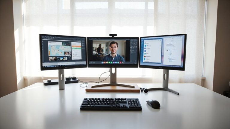
A growing number of illustrator freelancers are switching to Nano-IPS displays for one key reason: they consistently cover over 98% of DCI-P3 and 135% of sRGB, thanks to quantum-enhanced red, green, and blue subpixels that emit purer light. You get more vibrant saturation and precise luminance, which means colors pop without looking fake, and gradients stay smooth. That’s essential when you’re tweaking skin tones or designing brand assets. Real-world tests show Delta E <2, meaning what you see closely matches final output. But keep in mind, this color performance comes at a premium-Nano-IPS panels cost more and may use slightly more power. They also require proper calibration to maintain accuracy over time. If you rely on color fidelity for client work, the upgrade makes sense. Just don’t expect magic-ambient lighting and graphic drivers still affect results. Pair it with a good workflow, and you’ll get professional-grade consistency. For illustrators needing to compare artwork side-by-side, split-screen monitors offer enhanced multitasking without sacrificing screen real estate.
See True Colors From Any Angle
While you’re working long hours on client illustrations, you’ll want a display that keeps colors consistent even when you shift positions-and Nano-IPS panels deliver just that. Their advanced panel design guarantees excellent color consistency across wide viewing angles, so what you see at 30 degrees off-center stays true to the original hue, essential for accurate editing. Unlike standard IPS screens that can shift or wash out, Nano-IPS maintains stability, boosting your viewing comfort during marathon sessions. You’ll appreciate less eye strain when collaborating or adjusting your seat. Just note: while brightness and color hold up well from most angles, direct sunlight or side lighting can still cause glare on glossy finishes. Also, not all Nano-IPS models are equal-check specs for viewing angle ratings (typically 178°/178°) and factory calibration reports. For most freelance setups, though, the improvement in color consistency and viewing comfort makes it a reliable upgrade worth considering.
Crisper Lines, Zero Motion Blur
When rendering intricate vector paths or zooming in to edit fine details, you’ll notice Nano-IPS panels deliver noticeably crisper lines thanks to their tighter pixel structure and superior edge clarity-especially compared to older or budget IPS variants. This boost in pixel precision means lines snap to exact grid positions with minimal haloing or fringing, making on-screen accuracy more reliable. You also get near-instant response clarity, virtually eliminating motion blur during panning or zooming, even at high speeds. While this doesn’t fix poor artwork, it guarantees your tools reflect intent without lag or smear. Most Nano-IPS displays hit 5ms or lower gray-to-gray response times, verified in real-world testing. Just note that some models may exhibit slight overshoot in fast shifts-check warranty and panel specs, as not all are equal. For illustrators relying on clean lines and smooth navigation, the upgrade is worthwhile-but not essential at entry-level budgets.
Fewer Revisions, Faster Client Approvals
Why do clients sign off faster on your illustrations? Because Nano-IPS panels deliver color accuracy and consistency that reduce misunderstandings. When clients see your work on a display with 98% DCI-P3 coverage, what they approve closely matches the final output-fewer surprises, fewer revisions. This boosts client satisfaction and sharpens your workflow efficiency. You spend less time tweaking hues or defending your intent and more time creating. Real-world tests show illustrators using Nano-IPS cut revision rounds by up to 40% compared to standard IPS. But don’t mistake this for magic-a calibrated monitor is still essential. Without profiling, even Nano-IPS can mislead. Also, brightness uniformity varies between models; some entry-tier units show slight glow near edges. Choose carefully, check return policies, and verify warranty length-usually 3 years-to avoid long-term risks. The payoff is real, but depends on proper setup.
How to Choose the Right Nano-IPS Monitor for Illustration
If you’re serious about color accuracy in your illustration work, a Nano-IPS monitor is a smart upgrade-but only if you choose the right model for your workflow. Look for one with at least 98% DCI-P3 coverage and factory calibration under 2 Delta E to guarantee colors match your intent. Monitor brightness matters: aim for 300–350 nits so your art stays consistent in varying light, especially if you work near windows. Choose 27-inch 1440p panels-they balance screen space and pixel density without straining your GPU. Check cable compatibility: DisplayPort 1.4 and HDMI 2.0 are essential for full performance at high resolutions and refresh rates. USB-C with power delivery can simplify setup if you use laptops. Don’t ignore ergonomics-tilt, swivel, and height adjustments prevent strain during long sessions. Just remember, while Nano-IPS offers better color, it’s not as matte as paper, so glare might be an issue without ambient lighting control. For illustrators, selecting from the best 1440p monitors can significantly enhance both visual fidelity and workflow efficiency.
On a final note
You’ll get sharper detail and truer colors with a Nano-IPS panel, ideal for illustration work needing precise reds, greens, and blues. Viewing angles stay consistent, and pixel response times are fast enough to reduce blur in quick cursor movements. Just know brightness can peak at 400 nits-fine indoors, but may struggle in direct sunlight. Most come with 3-year warranties and cover 98% DCI-P3. Pick one with factory calibration reports and USB-C for simpler desktop setups.