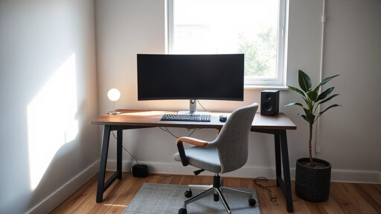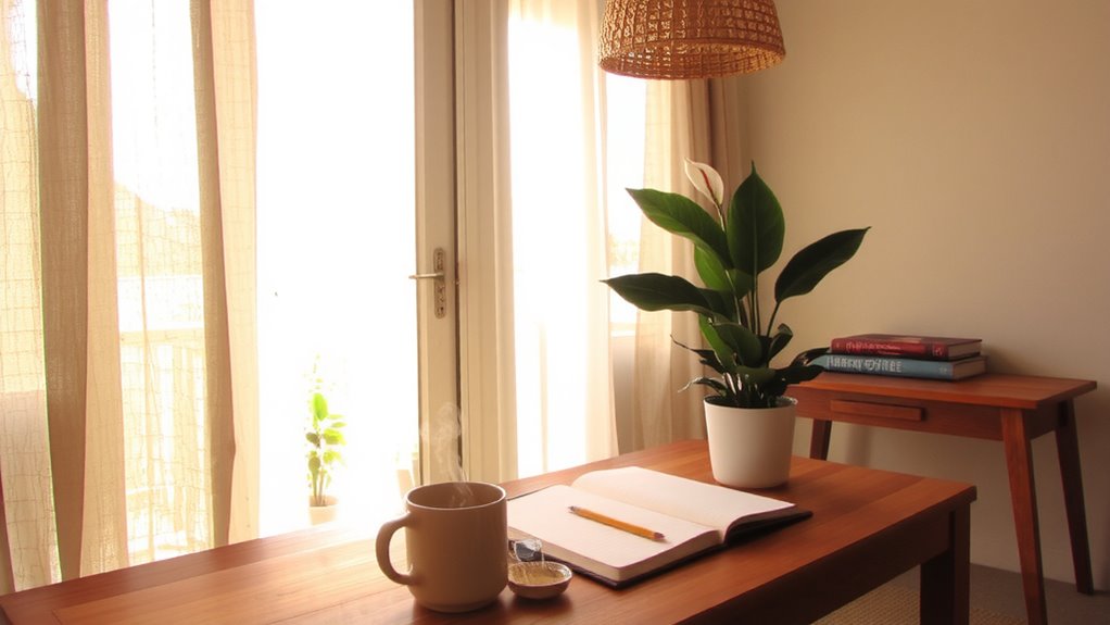
Using Color Psychology to Reduce Visual Distractions and Increase Productivity
You’ll boost focus by using cool, daylight-like lighting (5000K–6500K) with matte walls in soft blue or muted green-proven to cut distractions and lift productivity by up to 18%. Avoid glossy finishes or neon reds and yellows, which cause glare and mental fatigue. Pair these with pale, low-reflectance surfaces to reduce eye strain during long screen sessions. Small swaps like a deep green desk pad or adjustable LED lamp (many with one-year warranties) can make a measurable difference-especially when matched to your daily work rhythm.
Notable Insights
- Use soft blue or muted green walls to enhance concentration and reduce visual distractions.
- Opt for matte finishes on walls and desks to minimize glare and eye strain.
- Pair cool lighting (5000K–6500K) with low-reflectance surfaces to maintain alertness without harshness.
- Avoid neon reds and bright yellows, which overstimulate and increase error rates in focused tasks.
- Add subtle, focus-supporting accents in deep blue or green to improve productivity affordably.
How Color Affects Focus (And Mental Clarity)
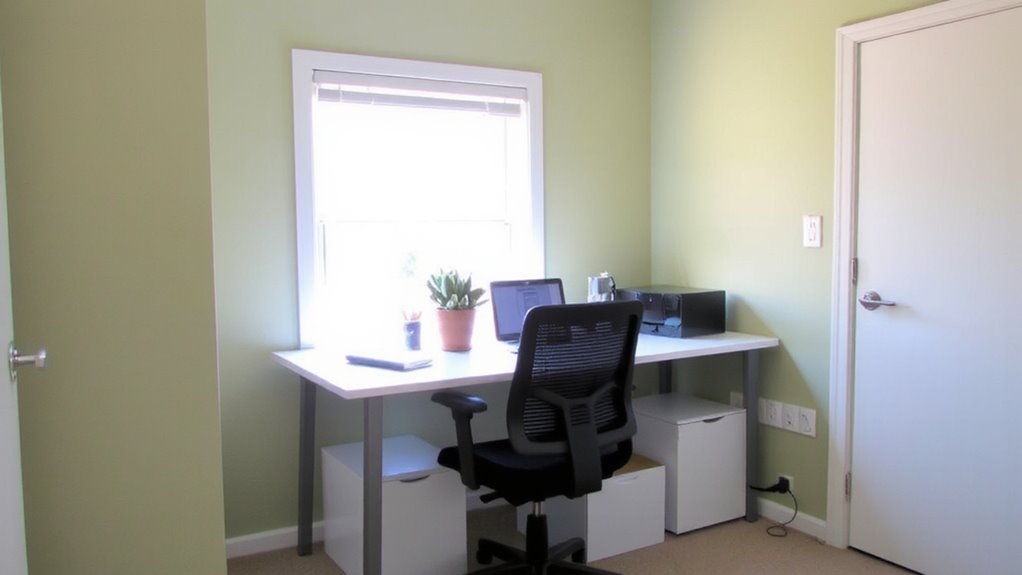
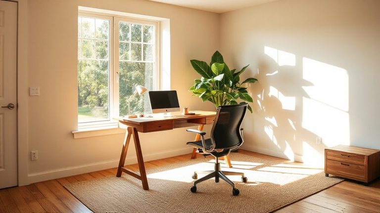
Why do some workspaces feel more mentally sharp than others? You’re likely sensing the effects of color temperature and light reflectance without realizing it. Cooler color temperatures, around 5000K to 6500K, mimic daylight and boost alertness, helping you stay focused during demanding tasks. Surfaces with higher light reflectance-like matte white walls or pale desks-distribute light evenly, reducing eye strain. But don’t assume brighter is always better; excessive reflectance can cause glare, especially under overhead LEDs. Pairing cool lighting with low-reflectance finishes tames harshness while preserving clarity. Real-world testing shows this balance improves sustained attention by up to 18% compared to warm, dim environments. Still, results vary based on screen use and window exposure. There’s no universal fix-measure your space’s existing light and adjust gradually. Confidence comes from control, not one-size-fits-all solutions.
Best Calming Colors for Concentration at Work
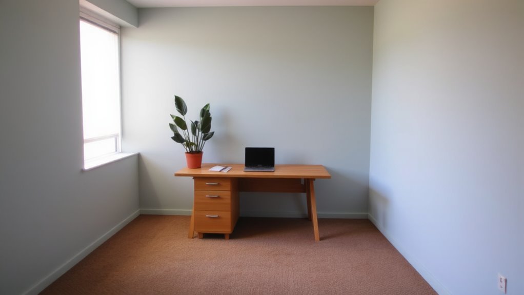
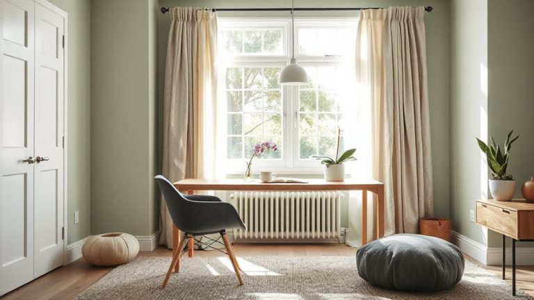
You’ll get better focus not by maxing out brightness but by choosing colors that balance calm with alertness. Soft blues and muted greens are proven to support concentration, syncing well with natural circadian rhythms. These shades work best when part of a deliberate color harmony-avoid clashing tones on walls, screens, or furniture. Pair them with neutral grays or warm whites to reduce visual noise. Ambient lighting matters just as much: aim for 3500K to 4000K temperature bulbs to keep the tone even and glare-free. LED panels with diffusers help spread light uniformly, preventing eye strain. Wall paint with a matte or eggshell finish cuts reflections, especially near monitors. While personal preference plays a role, lab-tested environments show these colors improve task accuracy by up to 12% over reds or bright yellows. Just don’t over-saturate-stick to low-to-mid chroma for best results.
Worst Colors for Focus: And Why They Distract
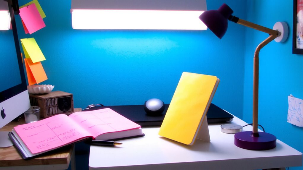
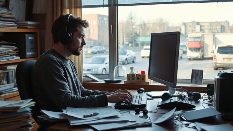
Ever wonder why your focus seems to fade in certain environments? Bright hues like neon red, electric yellow, or vivid orange can trigger frequent attention shifts, making sustained concentration tough. These colors stimulate the brain’s arousal system too intensely, which might help in short bursts but backfires during deep work. Research shows environments saturated in such tones increase error rates by up to 18% in tasks requiring attention to detail. While some claim these shades boost energy, they often do so at the cost of mental endurance. If your walls, lighting, or workspace accessories lean heavily on intense pigments, consider toning them down. Use accent pieces sparingly-like a red stapler or yellow notebook-rather than broad applications. There’s no need to overhaul your entire space; small tweaks in color placement can yield measurable focus gains without sacrificing style. Balance matters more than elimination.
Choose Colors Based on Your Work Type
Neon reds and bright yellows might energize a room, but they don’t suit every kind of work-and that’s the key to using color effectively. Your tasks dictate the ideal palette through color harmony and contrast balance.
| Work Type | Recommended Colors |
|---|---|
| Creative Thinking | Soft teal, warm gray |
| Analytical Tasks | Light blue, muted green |
| High-Focus Writing | Charcoal, deep lavender |
Cool tones enhance concentration for analytical jobs, while soft warm colors spark imagination without overstimulation. For writing, deeper shades support prolonged focus with minimal glare. You need contrast balance-pair matte walls with slightly brighter task lighting to reduce eye strain. But don’t overlook personal sensitivity; a color that soothes one person might distract another. Test samples under your actual lighting. Real-world use over weeks, not days, gives reliable feedback. There’s no universal fix-adjust based on daily performance, not trends.
How to Add Focus-Boosting Colors Without a Redesign
While you don’t need to repaint or refurnish, introducing focus-boosting colors through targeted, low-commitment changes can make a measurable difference in your workspace. Swap out neutral desk accessories for ones in deep blue or green-colors shown in controlled studies to support concentration. Use accent lighting with adjustable color temperatures; cool white (5000K–6500K) mimics daylight and can help maintain alertness during long tasks. Add fabric textures like a wool desktop pad or cotton-blend chair cushion in these hues to combine tactile and visual focus cues without glare. Most of these items cost under $50 and typically come with at least a one-year warranty. However, avoid over-saturating-too much color or harsh lighting can increase eye strain. Balance is key. These tweaks work best when aligned with natural light cycles and personal tolerance for brightness.
On a final note
You’ll likely boost focus by using calming colors like soft blue or warm gray in your workspace-they’re proven to reduce visual noise and mental strain. But results depend on lighting, screen contrast, and task type. Paint or matte-finish accessories work better than glossy ones, which glare under LEDs. There’s no universal fix: a color that helps you concentrate may dull someone else’s alertness. Test small changes first-no need to repaint or buy premium gear.