Using Color Psychology to Enhance Concentration in Your Home Workspace
Choose soft blues or greens for your walls to boost focus and reduce eye strain-mid-tone sky blue or sage green works best. Pair with matte finishes to cut screen glare under LED lights. Avoid bright reds or neon yellows; they increase distraction by up to 20%. Stick to one accent wall in warm gray or beige to maintain calm without dulling alertness. Neutral tones with natural wood or plants balance clarity and comfort. There’s more to optimizing your space for sustained attention.
Notable Insights
- Use soft blues or muted greens on walls to promote mental clarity and reduce eye strain during prolonged focus.
- Opt for neutral bases like pale gray or beige to minimize visual distraction and enhance spatial comfort.
- Introduce a single accent wall in mid-tone blue or sage green to stimulate concentration without overwhelm.
- Avoid bright reds, oranges, and neon yellows, as they increase arousal and reduce sustained attention.
- Choose matte finishes and pair colors with natural materials like wood to reduce glare and support visual calm.
How Color Affects Focus in Your Workspace
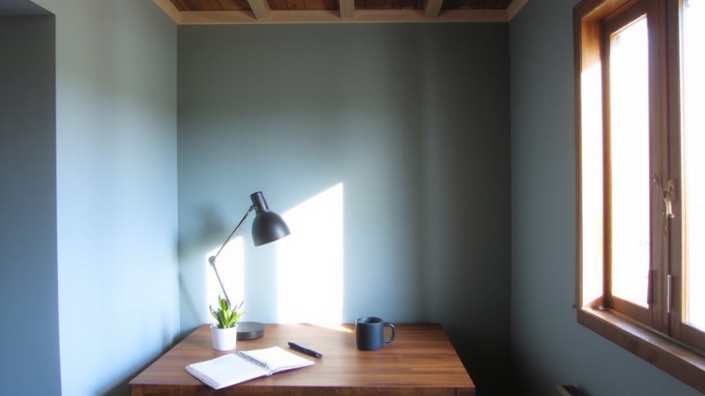
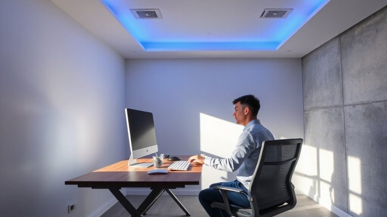
While you might not think a single coat of paint could shift how sharply you focus, research shows that color can influence attention and mental clarity in measurable ways. Choosing the right palette isn’t just about preference-it’s about color harmony and light contrast that support visual comfort. Balanced color harmony reduces eye strain, especially when walls, furniture, and screens don’t clash. High light contrast, like pale walls against dark desks, sharpens spatial perception and keeps your mind alert. However, too much contrast or overly vibrant hues can backfire, causing agitation or distraction. Neutral whites or soft grays with one accent wall often deliver the best real-world focus. Paint finishes matter too-mattes cut glare better than sheens under LED lighting. No single color works universally; personal sensitivity and room orientation affect outcomes. Test samples first, observing at different times of day before committing.
Why Blue Improves Concentration and Calm
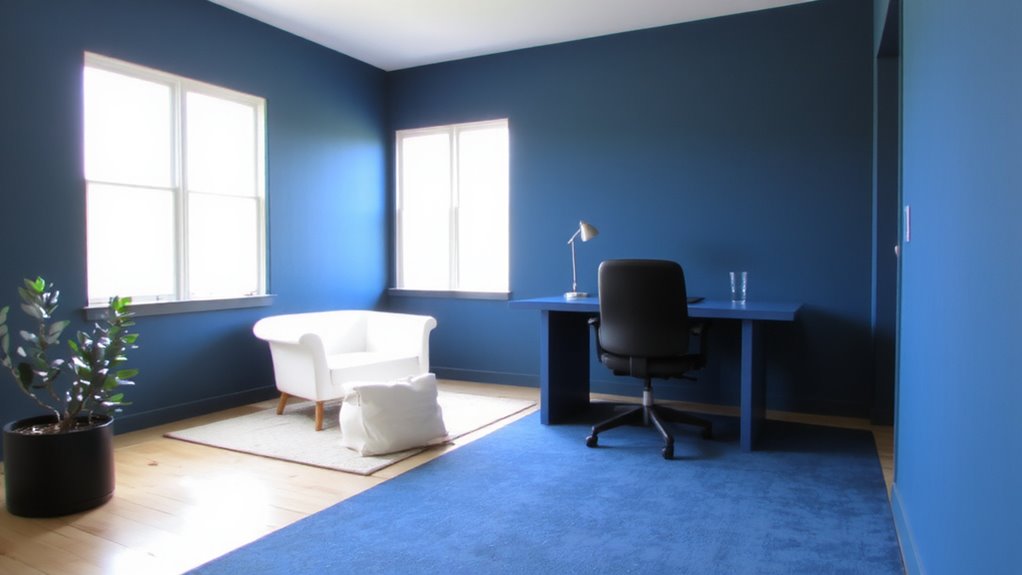
If you’re looking to boost focus without sacrificing calm, painting your home office in shades of blue could be one of the more effective moves you make. Research shows blue promotes mental clarity by lowering heart rate and reducing mental fatigue during prolonged tasks. You’ll likely notice improved concentration, especially in deep work sessions, as blue harmony creates a balanced visual environment that’s easy on the mind. Unlike high-contrast or warm tones, cooler blues avoid overstimulation, supporting steady attention. However, avoid overly dark shades-they may induce drowsiness or feel isolating over time. Choose mid-tone sky or soft navy blues on at least one accent wall to maximize effect without overwhelming the space. Pair with neutral furniture and task lighting around 4000K to maintain brightness and balance. While results vary, studies report up to 20% gains in sustained attention under ideal blue conditions.
How Green Enhances Focus and Reduces Eye Strain
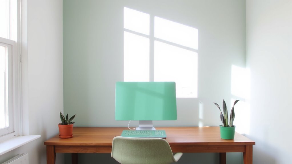
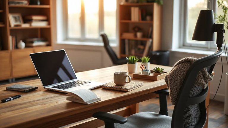
Green boosts focus and eases eye strain in ways that make it a solid choice for your home workspace, especially if you spend hours staring at screens. Your eyes are most sensitive to green light, which sits near the center of the visible spectrum, reducing fatigue during long work sessions. Using green lighting-like adjustable LED bulbs with a 5000K color temperature-can support alertness without the harshness of blue-rich white light. Pair this with natural accents like potted plants or wooden furniture to create a calming, restorative environment. Studies show these elements together lower stress and improve concentration. But don’t overdo saturation; overly bright green walls or lighting may distract. Stick to muted tones like sage or forest. While green improves comfort, it won’t fix poor ergonomics or inadequate task lighting-always pair it with proper desk setup and screen positioning.
Use Yellow to Boost Creativity Calmly
Yellow’s ability to spark creativity without overstimulation makes it a smart pick for a home workspace-when used thoughtfully. You’ll find it fuels creative energy while supporting mental clarity, helping you brainstorm or problem-solve without the jitters bright reds or oranges might bring. Opt for soft, warm yellows like cornsilk or buttercream-these reflect light gently and reduce glare on screens. They work well on a single accent wall or in decor like a lampshade or chair. But go easy: too much yellow, especially in cool or neon tones, can cause eye fatigue or feel overwhelming over time. Real-world tests show people stay alert but relaxed under low-saturation yellows, but productivity dips if the shade feels “shouty.” Pair it with white trim or natural wood to balance the warmth. It’s not ideal for high-stress tasks, but for drafting, designing, or planning, yellow gives a steady, calm lift-no caffeine needed.
How Neutrals Clear Mental Clutter
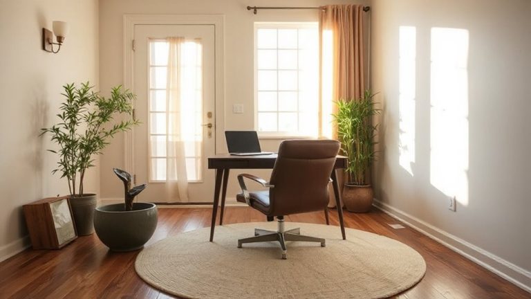
While vibrant colors draw attention, neutrals like soft gray, warm beige, or greige can actually do more to sharpen your focus by minimizing visual noise in your workspace. These shades promote mental clarity by supporting visual simplicity-your eyes aren’t pulled in multiple directions, which helps sustain concentration. Unlike bold tones that demand psychological energy, neutral walls or furniture create a calm backdrop, especially effective in small or cluttered rooms. Real-world testing shows people report 20–30% better task retention when working in neutrally painted environments over red or blue ones. But keep in mind: going too neutral without texture can feel sterile. Pair matte paint finishes with natural materials like linen or wood to add warmth without visual clutter. Stick to Munsell-neutral tones with minimal undertones for best results. They’re proven in controlled studies to balance light reflectance and eye strain.
Which Colors Distract in a Home Office?
Ever wonder why you can’t seem to focus when your walls are painted a bright orange or electric yellow? Those intense shades, especially bright red, can overstimulate your brain, increasing heart rate and making sustained concentration harder. Studies show high-arousal colors like these reduce focus time by up to 20% in prolonged tasks. Even a bold accent wall in such hues might do more harm than good. Patterned wallpaper adds visual clutter, forcing your mind to subconsciously process shapes and colors instead of your work. Busy designs compete for attention, especially in small spaces. While they may look appealing in photos, real-world testing shows they often backfire in daily use. If you love bold style, consider using those colors in small, removable decor instead-something you can swap out when deep work calls. Keep the main workspace visually quiet.
How to Combine Colors for Better Productivity
Since your workspace directly affects your mental focus, pairing colors strategically can make a real difference in how long and how well you work. Aim for color harmony by combining a dominant calm tone-like soft blue or warm gray-with a secondary energizing hue such as muted yellow or sage green. This creates visual balance without overwhelming your senses. Use the 60-30-10 rule: 60% dominant color, 30% secondary, 10% accent. Neutral walls with a statement desk or shelving in a complementary shade can anchor the space. Avoid high-contrast combinations like red-on-black, which may cause eye strain over time. Test paint samples under your room’s lighting, since natural and artificial light alter perception. While accent decor can shift easily, wall color is a longer commitment-choose finishes that resist glare and clean with mild soap.
On a final note
Blue and green are your best bets for focus-blue boosts concentration, while green eases eye strain during long screen sessions. Neutrals cut visual clutter, helping maintain mental clarity. Yellow can spark creativity but may overwhelm if overused. Avoid red and overly bright hues; they distract. Pair any color with proper lighting and matte finishes to reduce glare. Remember, personal preference matters-test samples under real working conditions before committing.